Howdy,
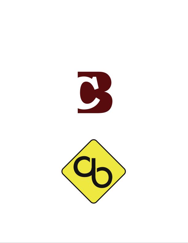
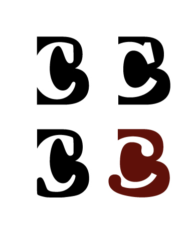
After much sketching, doodling and mucking about, I’ve narrowed down my pesonal logo to two options. I’d really appreciate it if I could get your opinions on em!
FYI: I’m a graphic design student, graduating this semester. This ID will be on my business cards and resume until I’m gainfully employed - and those items will be designed around whatever logo I go with. Keep in mind these are preliminary computer comps and the colors are (somewhat) arbitrary at this point.
My own personal thoughts, : I like the top one a lot but fear it may not seem very exciting; and I also worry if everyone will read it correctly. The second one I like; but, fear it may be too whimsicle and gimmicky.
Share your thoughts – good, bad, or ugly.
Cheers!
| Attachment | Size |
|---|---|
| File | 45.67 KB |
| CB_s2.jpg | 19.02 KB |
| CB_s4.jpg | 58.18 KB |