Well, what do you think?
| Attachment | Size |
|---|---|
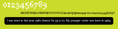
| sample.gif | 1.7 KB |
| extras.gif | 1.25 KB |
| two.gif | 5.1 KB |
| File | 3.79 KB |
Well, what do you think?
| Attachment | Size |
|---|---|
| sample.gif | 1.7 KB |
| extras.gif | 1.25 KB |
| two.gif | 5.1 KB |
| File | 3.79 KB |

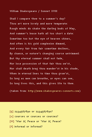
Your -2- is wonderful. That ampersand is absolute narcissism ... and I love it! The -W- is falling backwards. So is the -s-. So is the -5-, but I think it is because you need to extend the bottom exit stroke by one pixel. The -A- seems a hair too tricky. The -f- seems too short.
Can you show us another setting of the entire set spaced out a bit more?
Miss Tiffany,
Please take a look at two.gif. You were absolutely right about the swashy 'W'; it's much better now. As for the 's', the alternatives aren't any better, are they? And is that what you had in mind for the '5'? Because I don't think it works. So doesn't the longer 'f'. Now, what do you mean by The -A- seems a hair too tricky? As for the spacing, it's either that loose or dense as it was before; I'm not sure which one is preferable. What do you say?
Many thanks,
Ori
Okay, it's now clear to me that the new spacing is better. Thanks again, Miss Tiffany!
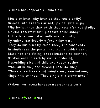
The fourth sample (drupal) shows: (a) better space between words; (b) better space between lines; (c) an alternative 's'.

what a beauty! I dig the ligatures.
And your new ‘s’ is way better.
Thanks, Gregory. As for the ligatures, they're actually useless, but designing them was fun. :)
Captured from commoncrawl.org on 26 Apr 2015. original URL