Looking to source the most beautiful U&Lc G/g
I know the publication of that same name had a fetish for the lower case ‘g’ from chesterfield.
what are your favoutites?
Looking to source the most beautiful U&Lc G/g
I know the publication of that same name had a fetish for the lower case ‘g’ from chesterfield.
what are your favoutites?
I’m not sure if I fully understand your question. Are you referring to the “U&lc” publication or to just U/lc in general?
If you are curious to poll personal favs for best uppercase “G” and lowercase “g,” then at this moment I have no “favourites.”
Past faces that I truly admired the design of “G” and “g” are:
Serif: ITC Galliard Italic by Matthew Carter
Sans Serif Display: Kabel by Rudolph Koch, Linotype
i referred to both upper and lower case and U&Lc the publication.
and yes was looking for a poll or those, as you state, that you truly admired the design of
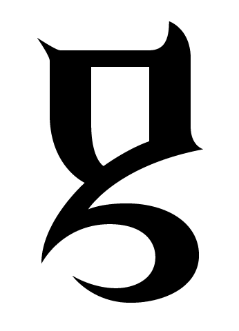
Certainly not the most “beautiful” (except maybe to a goth),
but to me this is the best glyph I myself have designed:
http://www.themicrofoundry.com/other/Brutaal-g.gif
hhp
Gee, Hrant,
it’s a good thing designs aren’t cast in metal anymore or else someone could get hurt by that “g”
I’m not sure if this “g” can look good, but a least it looks happy.
Captured from web.archive.org on 27 Nov 2005. view this capture