Hello,
I am seeking for some insight on the id I am working on at the moment. It’s almost a pro bono job, but I want to be able to show it off later. The guys produce a variety of TV shows and films (not a broadcasting company, just direction and filming). They work from UK (this is why Gill Sans looks so well for them) :)
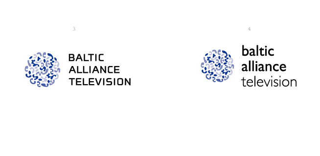
I was trying to play with “alliance” and stumbled over the Nebulae typeface. I’ve modified it a bit to achieve a less detailed pattern. I’ve also tried a more abstract “circle” instead of a “B”.
Anyway.
I would appreciate any comments from the board.
Cheers,
Alexey
| Attachment | Size |
|---|---|
| phile_baltid_4.gif | 10.66 KB |
| phile_baltid_5.gif | 8.92 KB |