Typophile

Blackletter Ligatures

paul d hunt

Why do i have such a thing for ligatures? I don't know. Anyhow, i'm wondering if we have an expert on blackletter ligatures in the house. I know that the half r can follow "round" letters (b d o p) to form ligatures. I know that the "e" can be attached to these round letters as well. i'm familiar with the double-p ligature. and then there are always your f-ligs and longs-ligs. then you have your historical German ck and ch ligs, which i'm informed are no longer relevant. And then there's tz, which is used in German. Are there more? I know that potentially everything could be a ligature, but i'm talking about fairly standard blackletter ligature conventions here. anyhow, if anyone knows of any other interesting combinations, pipe up!

> Why do i have such a thing for ligatures?

Maybe the same reason as me: boredom.

hhp

Ligatures for Blackletter? After all of the noise Goudy generated about stealing sheep, I've been afraid to touch it. Not to hi-jack the topic, but what did the guy mean? I would assume anyone who would use ligatures would also be concerned enough about appearance to letterspace as well...

"historical German ck and ch ligs, which i’m informed are no longer relevant!"

Ahm no sir! If you set German texts in Fraktur or any black letter typeface, you have to stuck to the old traditional rules since no one has change it. This means at least the long_s and hopefully the common ligatures. The round r is outdated since the time of Fleischmann.
Common ligatures are:
c_h
c_k
longs_c_h
longs_longs
longs_i
longs_t
longs_z (germandbls)
f_f
f_i
f_l
f_t
t_z
l_l
Even more ligatures are possible. Have a look at the original lead typeface of Klingspor Gotisch (not the Linotype digi version).

But anyway, dump, naive people set even German texts like common texts today - and it looks awful. But were is no standard of a Fraktur codepage or a Fraktur keyboard layout. Only a pseudo standard "Dfr" (Deutsche Frakur) is available - setting up the long_s and its ligatures on false glyphs on a standard codepage.

John, how is the status of the Fraktron project?
http://fraktron.sourceforge.net/

--astype.de--

    "I would assume anyone who would use ligatures would also be concerned enough about appearance to letterspace as well…"

Well, one would hope.

This may be of some blackletter relevance.

I ran across this archve last week.

  • http://moorstation.org/typoasis/designers/steffmann/index.htm
  • (FYI: I can't attest to the 100% legality of this archive)

    I think its all legal since all designs are pre 1950, but the technical quality is not my cup of tea. In overall it opens a little the univers of black letters for todays people.

    --astype.de--

    Andreas,

    The quality, of course, does leave a lot to be desired.
    But it is a nice reference point -- for free none the less.

    Paul, you know that you are a blackletter-expert, too!

    I've found that old specimens (like that for Wilhelm Klingspor Gotisch) often you you everything you need to know. Richard must have some, right? E-mail me if you can't find anything…

    Also, I think that some of the ligatures are style dependent. If you are designing a real textura,* for instance, then the half-r would be kind of cute, even though printers stopped using them in the 18th century. But a fraktur, unless it was a Nuremburg fraktur, could probably do without them, etc.

    *As long as your texura isn't an Old English…

    expert-texpert

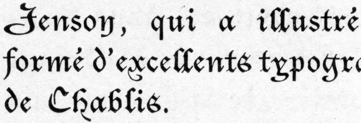
    In the Christian Gothic (Imprimerie Nationale, 1902), I'm working on, the complete set of ligatures is:

    ff, fi, ffi, ct, tt, ll

    Note that fl, in particular, is not ligated. Obviously, fj is uncommon in French, but presumably it would follow the same rules as fi.

    Additional variants include: final s, final n, initial v. There are also final-swash e, t, r.

    When I release the font, all these ligatures and variants will be included. I'm still undecided which ones to make optional, though - I think that'll take more experience using the type in present-day settings.

    John, how is the status of the Fraktron project?
    http://fraktron.sourceforge.net/

    Shamefully paralyzed and festering. :-( That should change soon though...

    Paul, there are literally thousands of scribal ligatures used in the original blackletter calligraphy and in Gutenberg's own B42 type. The most common is any letter with a bar over it indicating a doubled letter. For an exhaustive survey see Ulrico Hoepli's Lexicon Abbreviaturarum. Horrible cameraphone pictures of it here: 1 2 3. (Bottle shown for size comparison purposes. Urp.)

    You should also give Carter & Cone a call and buy Flammande and Flammande Archaic.

    cool. is there anywhere that the full Carter & Cone catalog can be previewed. Flammande isn't in Indie Fonts and that's the best C&C resource i've got my hands on at the moment.

    John, the Dizionario di Abbreviature... is by Cappelli; Hoepli was just the publisher. It is often referred to simply as 'Cappelli'. Another good reference book for scribal contractions is The Record Interpreter by Charles Trice-Martin. This is more specifically British in its focus, being intended as an aid to deciphering public rolls, parish records, etc.

    [The equivalent volume for Greek is T.W. Allen's Abbreviations in Greek Manuscripts, which is helpfully included in the more recent collection Abbreviations in Greek inscriptions, papyri, manuscripts and early printed books edited by Oikonomides.]

    There is also what looks like a really useful electronic dictionary, Abbreviationes. I have not used this, largely because it is only available for the Mac, but it seems very promising.

    Aack. My mistake. And thanks for reminding me about Abbreviationes.

    It looks as if I've been misspelling Flamande, too. Paul, there is a sample of Flamande here. Along with some lovely Orgelmusik to download.

    i've never seen a blackletter ll ligature. can anyone link me to an image?

    Paul,

    A few of Helzel's fonts have them. They're generally the exact same l just doubled. It's more of a German typecase ergonomics issue than a design issue.

    Sure. Here's a 600 dpi excerpt from page 14 of Christian's Debuts book. As you can see, it's a real ligature, not just two individual 'l' glyph stuck together. I didn't realize such a thing was so rare.

    Captured from web.archive.org on 22 Mar 2015. view this capture