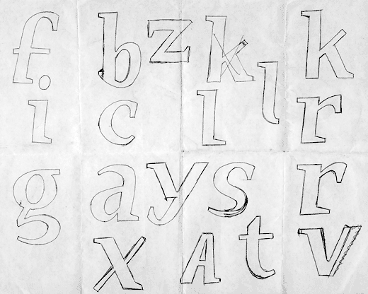
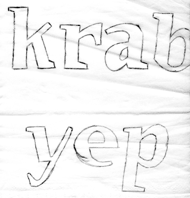
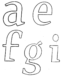
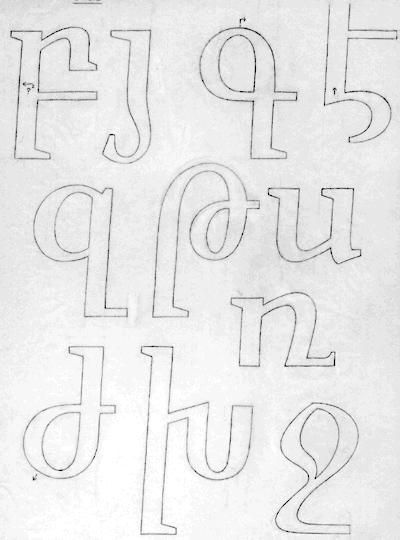
There are times when I need to sketch out
a name, acroynm, or phrase in a particular
typeface during the conceptual stage.
Usually, I just write out the name with
a thick marker. However, this technique best
conveys form, direction, etc..but NOT the
subtleties of weight, contrast -- especially
with serif faces.
My attempts to "draw" out the typefaces more
clearly seem rather dissappointing.
For those who may know, are there any helpful
methodologies or advice to be given as to how to
sketch out letters more clearly?
Note, I am a graphic designer not an illustrator,
nor have I designed type before, thus my drawing
skills lack savvy.
p.s. the technique known as "building-up" the letter,
is one that has merit, but takes too much time with the
filling in...I need something more efficient yet
visually clear.