Hi guys,
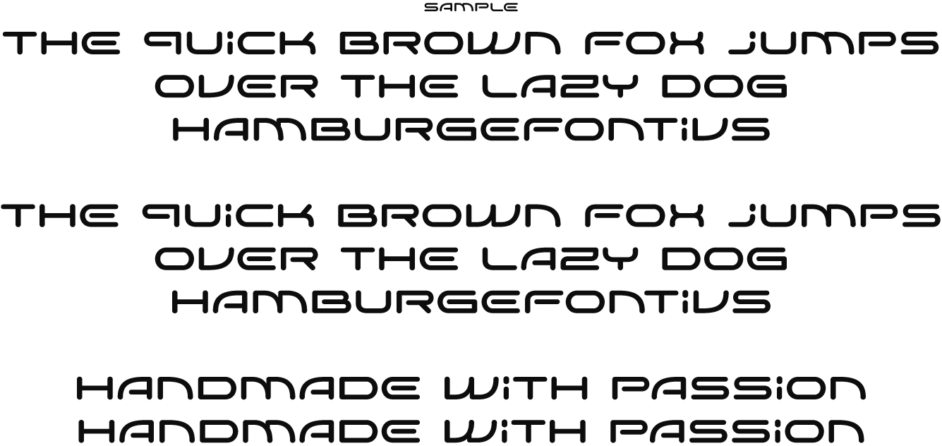
This is a corporate font I made for a client called Siventi Products B.V.
I made the logo by hand, designed the complete CI for them and will do all the packaging too. The next logical step is this font that will be used in their promotional items (ad’s, product labels, packaging, display material, website, etc.).
The typeface has to be ‘classy’ but also ‘forward thinking’ and ‘contemporary/modern’. The way the word 'Siventi' is written in the typeface matches their logo exactly. The other characters I’ve designed around it to complete the font.
The thing we are still working on are the M and W. The N and V are accepted in the logo but we are looking for the best possible solution.
I have made 8 versions of the M and W and I think this is the best one until now. Does anyone disagree with these characters?
If you look closely there are two versions in this PDF. If you look for the sentence ‘Handmade with passion”, my favourite is the second sentence. It’s more homogenious with the N.
If you see anything else you like/dislike, please let me know.
Thanks,
®ené
| Attachment | Size |
|---|---|
| SiventiLogo.gif | 31.64 KB |