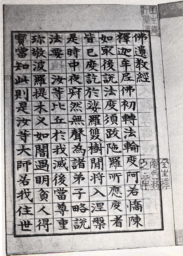
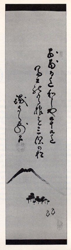
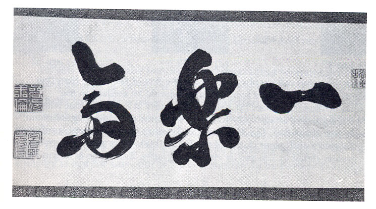
A while ago there was a debate going on about Chirography in roman texts and Hrant suggested/stated that Chirography was antithetical to good Notan in letter/type design. Thinking about this I wrote at the time that Japanese Caligraphy seems to have both & without suffering for it - especially when it is exceptionally good. The greatest Japanese Caligraphy I know of ( and I am not *so* educated about this so feel free to post your own examples ) is the Caligraphy of the swordsman Teshsu. Here are some pages about him.
http://www.traditionaloshigata.com/articles/Tesshu.htm
http://www.daito-ryu.org/kako3.html
I have also atteched some scans from a book I re-found recently. Check em out. 001 is actually not Teshsu’s but his teacher’s. Pretty fine too - no?
What I wanted to point out is that in these examples there is tremendous flow, beautiful balance and assorted other caligraphic virtues. And beautiful notan. It seems to me that contrary to Hrants assertions, great notan & chirography should be able to exist in a roman typeface as long as beautiful notan is one of the variables being striven for. It may be that this was only seriously possible with roman caligraphy until recently because of the compromises inherent in a metal & then electronic & finally digital type design - but with Open type it seems like a caligraphic level sensitivity to letter relations (both shape & placement) and therefore notan is quite possible now. Bello seems like an early example to me.
Being just a budding typophile I may be making a hash of this set of ideas - but this is what I am thinking today. I invite further comment & greater enlightenment.
| Attachment | Size |
|---|---|
| 003.jpg | 284.8 KB |
| 002.jpg | 65.9 KB |
| 001.jpg | 134.72 KB |