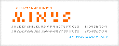
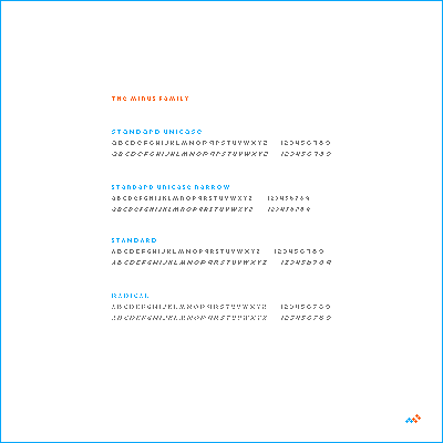
Here's a fun little one. As usual, I was working on an entirely different font when I 'fell over' the 'w' in what would become this character set.
I remembered the way Andrew used negative space in his font "Pug', even going so far as to split the lc characters from their stems in an effort to balance out their color. so i tried something like that here.
it's an interesting little study, for a font four pixels high.
| Attachment | Size |
|---|---|
| minus.gif | 3.36 KB |
| minus02.gif | 2.71 KB |