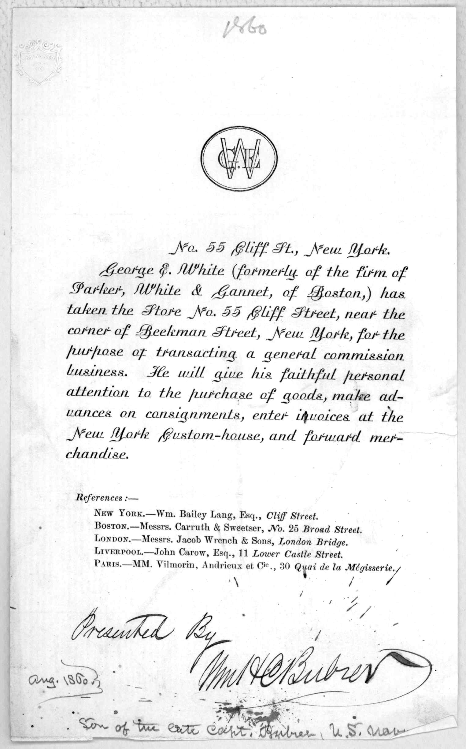
was just browsing the LOC, and gosh -- what is this?
http://memory.loc.gov/cgi-bin/ampage?collId=rbpe&fileName=rbpe12/rbpe123...
| Attachment | Size |
|---|---|
| 001dr.jpg | 182.47 KB |
was just browsing the LOC, and gosh -- what is this?
http://memory.loc.gov/cgi-bin/ampage?collId=rbpe&fileName=rbpe12/rbpe123...
| Attachment | Size |
|---|---|
| 001dr.jpg | 182.47 KB |

Boy, I seem to recall coveting something very similar to that. Hmmm...
yup, i've covered the usual sources - haven't found anything like it?
BIzarre. The lowercase forms are seem related to the map lettering of the 17-18th centuries, some of which were digitized by Tobias Frere-Jones in his Surveyor font for Martha Stewart. But the caps and the baselines are wacky.
It's like someone was trying to make a script out of a serif italic.
except there are no serifs...

Fascinating. Somebody should check McGrew.
hhp
looked there, didn't see it?
Ah! Right. Ok. I'll license it right now before I forget. Is this the only version of it?
Italian Secretary is quite lovely as well.
Has anyone written anything at length about this foundry? Google shows a few little bits, but nothing extensive.
dunno. the digital version seems fairly faithful, but the baseline connectors have been flattened-out (noticeable on the 'c' and 'e' especially), which seems a little unfortunate. oh well.
Captured from web.archive.org on 6 Nov 2013. view this capture