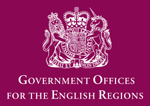
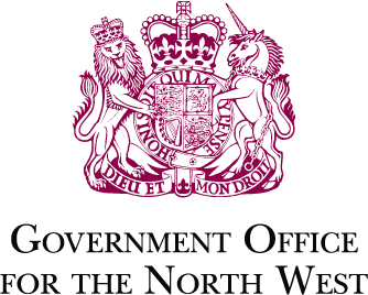
My organisation uses Baskerville in its identity. There are ten distinct branches; the attachments show the central office and (in better clarity) one of the regional offices. You can find out more here:
All are part of the UK government.
I’ve recently been asked, in my capacity as a designer at one of the offices, to help with branding guidelines. The current branding was issued in 1994, and is in use at 11 offices across England, each employing about 300 people (so maybe 3500 total). It appears on business cards, signage, stationery, PowerPoint presentations and everything else you’d associate with a large corporation.
Given the installed base, I can’t recommend substantial alteration to the identity. But I am considering resetting the text. You’ll have noticed it uses artificial small caps: in my opinion, this is a poor choice, particularly as the ITC New Baskerville used has a small caps version. Thus, I’m considering the following options:
1. Leave everything as it is. This is cheapest, and no hassle.
2. Switch to ITC New Baskerville (small caps), and recommend upgrading all signage, stationery and so on immediately at considerable expense.
3. Switch to ITC New Baskerville (small caps), and recommend that it’s implemented when possible (eg. change website immediately, b/c on next order, signage can remain).
4. Recommend switching to one of the other baskervilles available, and either update all immediately (as 2) or when necessary (as 3).
Let me know your thoughts, and arguments for or against change. I need to make a presentation on this a week today; after that, I’d need to get buy-in at director level. Change is possible, but I need to project a very cogent case.
| Attachment | Size |
|---|---|
| natlogo.jpg | 8.73 KB |
| gonw.png | 22.26 KB |