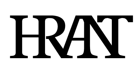
(No, not ligatures for FF Meta...)
One of my fascinations in the field of "visible language" are shapes
that stand for more than one letter. It's interesting to consider how
they combine, what parts are "important", and how the recognition of
the components is weighted (intentionally or not), when alone or even
more interestingly in the contexts of words. I can't stop thinking of
this topic, even in banal places like Dairy Queen, where I daydream
weather a logo that's a "D" with a tail would work (or maybe it would
drive their loyal customer base back to the mountains.)
Below is something I did when working on Trajic notRoman, years ago.
But more than show what I've done (not much anyway, really) I'd like
to collect and compile examples you guys might have seen. Please let
me know of any metaligatures that you think are worth thinking about!
(Oh, and as always I'm open to terminological
suggestions as to what to call these things.)
hhp
| Attachment | Size |
|---|---|
| knnight.gif | 2.58 KB |