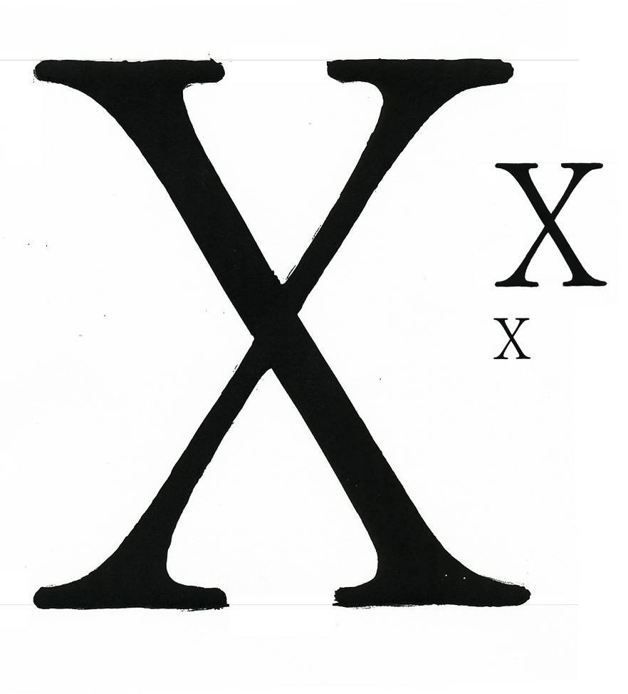
I'm not sure if I posted this in the right spot. But since I'm not looking for a crit, seems good enough.
I'm having a weight issue. My letters so far are very heavy in the curved axis' and the stems, but my thin strokes are quite thin in relation.
It almost seems somewhere in-between standard and bold. Would a bold have thicker thin strokes, and would standard have thinner axis/stems, while having a slight reduction in the thins?
is Text face letter,
THX
7.17.05
Ok, I just need somebody to look at this x. Just in the context of an x. I think it's close.
| Attachment | Size |
|---|---|
| X.jpg | 120.48 KB |