Typophile

(x) Kodak keycode on film negative - Copperplate Gothic {John Butler}

Tollundmanden

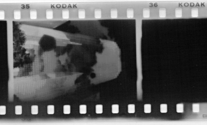
I'm trying to find the font Kodak uses for it's keykodes on film negative. You know, the little numbers and letters that run along regular 35mm film negatives. Unfortunately I haven't been able to google up a detailed picture, these one are the best I can find.
It doesn't have to be the exact font, any similar sans serif will do.

http://home.germany.net/101-81660/keycode.jpg

http://home.germany.net/101-81660/randnum.jpg

Have you asked Kodak? Are you sure you can't find something bigger for us to see? These examples are too small!

Also you could scan some film ....

The number looks like a Univers Extended to me. The Kodak looks like a Modified Franklin gothic Wide. The O in particular looks like the modified Character. That's my best guess.

Copperplate?! Why?

"any similar sans serif will do"
Then use Univers Ext. or Helvetica Medium Ext.
And wide tracking.

John, Wow, those serifs really disappear on the film! It looks like you have it.

Or maybe there are two versions.

Lasse why did you want to know? Especailly if “any similar sans serif will do”.

> those serifs really disappear on the film!

Which of course explains the application of thorns, especially on filmfonts.

hhp

>Thorns

To give a nice sharp point? Otherwise impossible?

Well, any medium where focus is not always perfect ends up rounding corners. I can't think of a way besides over-sharpening to counteract that. A lot of fonts, even original digital ones, have thorns (although usually very mild ones). Probably because human vision itself has imperfect focus.

hhp

Captured from web.archive.org on 5 Sep 2019. view this capture