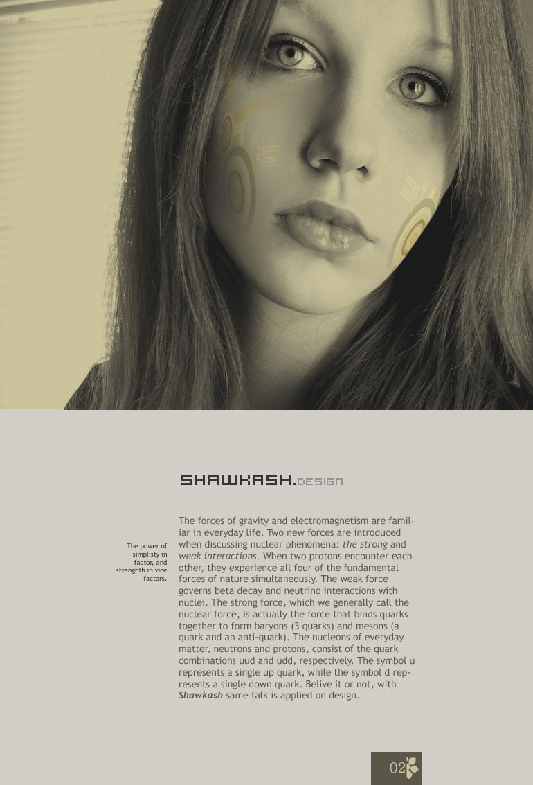
I need critic on the attached file.
color scheme and layout concept of refresheing the layout of my papers.
my brief: simple layout reflecting the typography and photomanuplating skills with spot on vector specilization. The reading would be on web and it is acceptable to be printed in colors or black and white. The concept about the beauty which produced by deep study and high tech. command.
I didn't reach the last decision on it yet.
fonts, Hooge as advertising font. ( I placed it in normal pixels settings, but this font is not an end up deal the whole typography may be reformed. I am just showing here the CI idea ) - Conceptually this font is ideal for me to represent that 'computer text' look. It is new idea I guess, and I got some feedback telling me that it really clashes with everything else. I want to know your opinion.
Trebuchet as reading font. ( I may change it to frutiger.)
Model: Heather
| Attachment | Size |
|---|---|
| shawkash_papers.jpg | 128.67 KB |