
any advice?
| Attachment | Size |
|---|---|
| bb.jpg | 12.64 KB |
any advice?
| Attachment | Size |
|---|---|
| bb.jpg | 12.64 KB |

Order this book http://www.logofontandlettering.com/

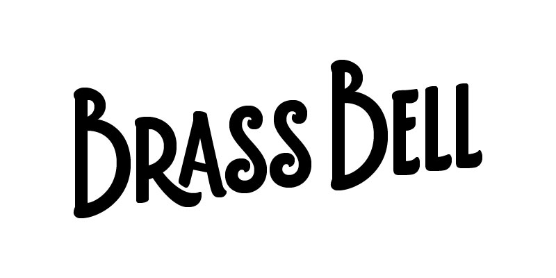
Aaron, is this just a logo, or a full typeface idea? If it is a full typeface idea, we should see more characters. That would help us help you more.

I see promise in that B. I would first say you do need to finesse your beziers a bit more. Something like this deserves crisp and articulate curves and strokes.
this project was on hold for a while, but i've been working on it again for the last few days... sure could use some critique. i've had quite a bit of trouble--both with the RAS letter combination, and with making the mark bold (it started off very light). any advice from the experts out there is greatly appreciated... does it just totally suck? i've looked at it so long now i can't tell.
/aaron
Captured from web.archive.org on 19 Apr 2015. view this capture
