Typophile

node 12923

Many of you probably already know this, but real estate agents like to have their own logos even when though they are affiliated with existing brokerages. Their line of work is inherently independent. As they establish themselves and their client bases, they like to create a logo to use alongside the brokerage logo so they can differentiate themselves from other agents.

My sister-in-law is reaching the point in her professional development where her own “brand” starts to make sense. I asked her about some of the things she’d like to communicate with her logo and I tried to deliver those messages. (I’ll keep them to myself for now… if your impressions don’t jibe, I’ll now I have more work to do!)

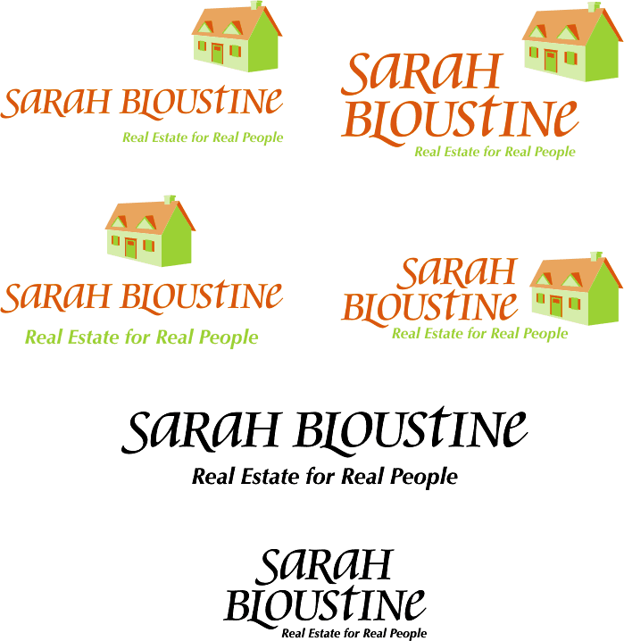
I’ve presented four logo/logotype lockups and two all-text lockups for analysis. I’ll be excited to read any and all feedback you care to share!

Mike

AttachmentSize
sbre.gif35.6 KB
unknown

To be sincere, I think the ‘house’ is just too much.. ( It seems way too detailed and playful, almost ‘cliparty’, for a logotype )

I like, and prefer, the ‘text only’ version..

unknown

“Real estate for real people” bothers me, I find it offensive. What people who don’t use her service aren’t real people?

Unless your sister in law is loaded with money find a way to make the mark one or two colors.

Is she only brokering home properties as opposed to commercial properties? If she is also brokering commercial properitites loose the house and make it a word mark.

Just some thoughts.

unknown

David,

Thanks for the feedback! I drew the house manually. I was aiming for a graphic with dimension and a bit of movement, but I was also trying to keep the shapes simple. Sounds like I didn’t meet that objective very well.

Regarding the text-only version… the logotype was the first thing I did, and I worked HOURS on it. I intended it to be strong enough to stand on its own when the logo graphic wouldn’t be appropriate. Do you think it’s strong enough on its own? (This logo will almost ALWAYS be seen in a real estate context, so it doesn’t necessarily need to have a real estate picture.)

Thanks again for the feedback! It’s exactly what I need since I am not a full-time designer and I am working in a vacuum.
Mike

unknown

To make a useful critique of this I think we should see the logo it has to work alongside, especially the two colour version. My initial impression is that I prefer the wordmark version, although the lowercase letters feel a bit heavy and the crossbar of the t is interfering with the ascenders and the S, a, t and e don’t have as much character (or at least a different character) as the remaining letters.
Tim

unknown

Mike, Yes, I think the word mark may be strong and classy enough, on its own..

unknown

Dan,

Thanks for the feedback!

Regarding the Slogan
“Real Estate for Real People” is meant to convey that she caters not just to affluent people, but to “ordinary” people. (Real estate agents love to market themselves as being focused on the individual.) It didn’t occur to me at all that it could be read the way you read it, but that’s why I posted to this forum!

Regarding Color
As is, the logo is only 2 color. The shading is acheived through tinting. I also prepared grayscale and 1-color versions of these logos, knowing that 2 color tint printing has to be of good quality to work.

Regarding Her Market Focus
She is mainly focused on residential markets, but we talked about that before I started designing. I felt the house mark could be used when she was marketing to homebuyers and the wordmark could stand on its own for commercial properties.

Thanks, Dan, for taking the time to comment on this design. I’ve read some of your comments on other logos and I really appreciate the quality of your critiques.

unknown

Tim,

Thanks for taking the time to reply. Regardless of what happens with the logo, I want the logotype to be of the highest quality I can muster. Your comments will really help with that.

The Crossbar on ‘t’
I slightly modified the left terminus to parallel what the ‘S’ is doing. It’s very subtle and hard to see at the size I posted, but that was my attempt at harmonizing where those strokes approach each other. On the other side of the crossbar, I can see what you are saying… the fact that it sends below the serifs on the ‘I’ makes that area a little rough. I will take a close look at it.

Regarding Lowercase Letter Weight
I was worried they were actually too light. I strove for optical balance, but I may need to work on it some more if you feel they are too heavy.

Regarding Glyph “Character”
I built the logotype from two existing faces. Swash characters are available, but I found them to be a bit too much. The swash ‘a’ is unusable because it’s only appropriate when that letter is the last one in the word. The swash ‘e’ has a neat spur extending from the crossbar, but I felt it was too “swooshy” and out-of-place considering I wasn’t able to incorprate any other dramatic swashes.

Thanks so much for taking the time to comment!

unknown

Keep it simple:
Sarah Bloustine • real estate
straight to the point, that’s what real estate is all about right? Nice typo, nice colours. I wouldn’t use that house though.

K.

unknown

“Real estate for real people” sounds like any/all cheesy slogans that real estate agents come up with. Maybe that’s good. Maybe that’s bad.

unknown

The wordmark is great. I don’t know if it’s the most appropriate to real estate, with all of its quirk, but it has a personal touch to it that sounds like something the client really wants.

I don’t like the font choice for the tagline. The bold italic Optima feels out of place to me. Also, I don’t like Optima in most instances I’ve seen it in. (It gets abused too often and now I associate it with amateur work.) It seems incongruous to the script font. Perhaps a sturdy old-style serif? As for the tagline, I kind of like it, in spite of its cheesiness. I mean, 99% of real estate agents have horribly cheesy indentities with bad photos of themselves anyway, so it’s better than the norm.

Get rid of the house. It makes the whole thing feel ‘country cottage cute’ to me. I’d go with something much simpler and more elegant, or nothing at all.

The color doesn’t click for me, either. It doesn’t say real estate to me. That pale lime green might be a bit light for the tagline, as well.

Keep at it!

unknown

Kris,

I actually had just “Real Estate” at one point. With all the guff I am getting (and the guff is good stuff!) about the slogan I wrote, I’ll probably go back to that.

Thanks for taking the time to comment!

unknown

Chris,

Regarding the Wordmark
I was trying to make something a little different than what you normally see in real estate logos, so I am glad that resonates. (Of all the many examples I looked at, every single one is bad. Hopefully my attempt doesn’t add to the bad pile!)

Regarding Optima
I specifically chose Optima (aka Zapf Humanist) because it has caligraphic strokes. I thought it contrasted nicely with Cataneo (the font family used to build the wordmark) but I might try out a few other sans serifs. I plan to avoid using a serif for the slogan because I think it will clash. It will be challenging to find a serif that harmonizes with the serifs in the wordmark.

Regarding “Get rid of the house.”
Nobody likes the house! :-( Oh well, I am going to have to face reality on that one.

Regarding Colors
They come out a little pale in the exported gif. Some sort of green and some sort of orange are what we’re thinking, though. We’ll sit down with a swatch book once we make something that’s going to go to press. These colors are definately a departure from the rediculous abuse of color in other agent logos I’ve seen. We’re trying select colors that are energetic and sophisticated as well as warm and welcoming.

Thanks so much for the feedback!

Mike

unknown

Personally, I don’t like the lowercase ‘a’, ‘t’, and ‘e’ being mixed with the uppercase forms. I know some people really like this stuff, but to me it just seems mishmashed.

The ‘L’ swash is great, though if it was a bit longer it could serve to separate “Real Estate” from “for Real People”.

If you’re going to use a house image, make it a lot more stylized and simple than that one.

All in all, you’re on the right track!

unknown

I agree that the wordmark is strong on its own. Be sure to test it at worst-case sizes (tiny) so the nuances aren’t lost. A special robust version for small sizes might be needed.

= David Randolph Koski =

unknown

I agree with bergamot about the unicase treatment. It already looks dated. If you disagree, then give it 2 years. The letter combination in this typeface seems ill suited for unicase treatment by nature. See the aRa combo and t for example.

Consider trying sarah in the lowercase italic, and BLOUSTINE in smallcaps. Also, conisder limiting it to one swash character (or none).

For the tagline consider: Real Estate for the Really Stately Domicile Savant :-)
I’ve “designed” real estate before and the challenges are many.

Good luck.

unknown

Approaching this the way a consumer would, I think the house, even though hand drawn, is like others have said too much and looks like clip art. That doesn’t mean you have to lose some sort of graphic, just try something more custom made depending on what kind or property and clintale your sister is trying to attract. To me the font gives off a quaint, domestic-type feeling. So depending on what you’re going for, those might not be the adjectives you were looking for. I also don’t like the up and down style in the name. I think a one or two color logo would be punchy in addition to being more affordable.

Captured from web.archive.org on 29 May 2006. view this capture