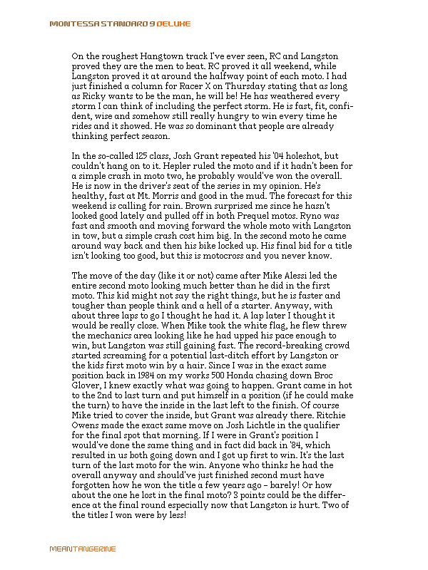
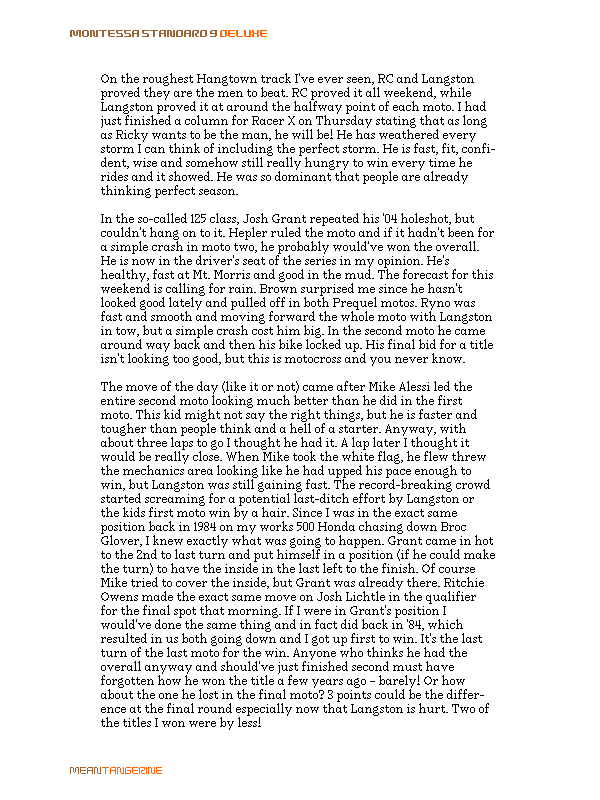
Here are two visuals that illustrate one of my standard pixel fonts, before and after some gray treatment.
What do you think? Are the grays used effeciently, or could they be better?
The main difference in this post, as opposed to other's I've submitted in the past, is that these are gray fonts that I've actually built and published, rather than studies done in photoshop—title, text, and signature fonts included.
I've tried to limit my selection of grays to black and three shades, although I think I ended up with four.
| Attachment | Size |
|---|---|
| deluxe.gif | 24.37 KB |
| regular.gif | 19.87 KB |