I am working with a client that sells cleaning franchises, has cleaning services and sells products related to the same field.
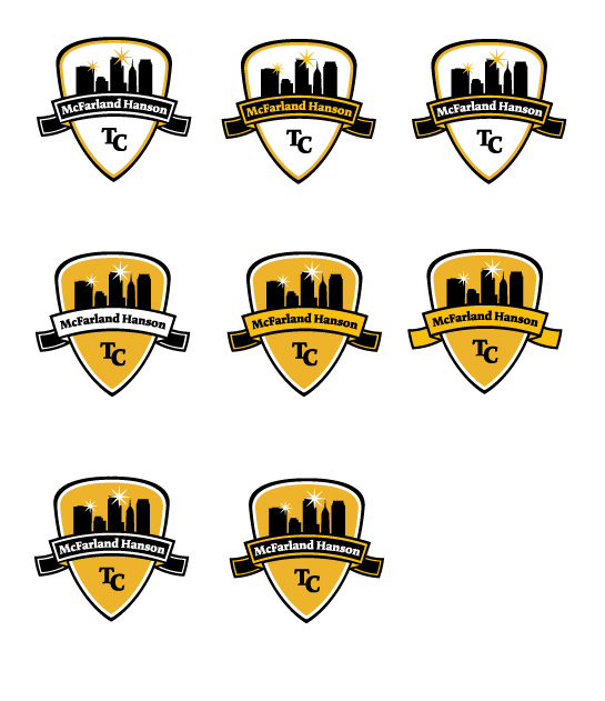
I know some will be automatic no's, but the client came back requesting the stroke on the banner/nameplate. So i worked up some variations
Does the stroke inside the nameplate work?
Does the other variation? Other tips?
I personally think the marks with the gold fill in the middle are much better. (2a, 3a and 3b would be the direction i would choose) Any opinions elsewise?
Don't mind any variations in craft, they aren't final. Anything else?
| Attachment | Size |
|---|---|
| Rough_Final.jpg | 116.39 KB |
| Rough_Final1.jpg | 26.18 KB |