Hi,
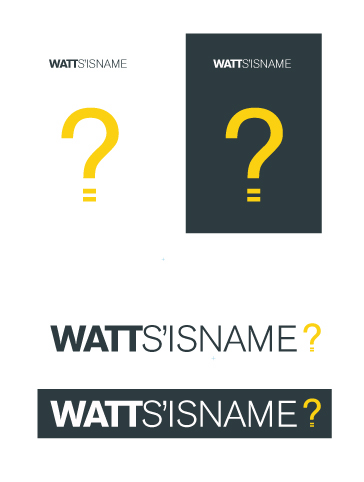
I have just finished uni and I'm in the process of creating an identity for self promotion purposes. I've come up with a name and an idea that I'm happy with based on my surname (Watt). I've discovered an amazing observation that a bit of a pun (using watt as the question 'what') and the connection to the unit of power can both be represented in one symbol because a question mark incredibly resembles the shape of a light bulb.
After some development, I've arrived at this solution but I'd love to see what some of you guys think. Does it work? Is it too cliched? How would you tackle it or improve the idea? Obviously all comments and opinions are valued and appreciated and will be considered.
Thanks,
Ed

| Attachment | Size |
|---|---|
| watt_identity.jpg | 70.87 KB |