I'm tired of defaulting to Gill Sans and Futura for simple,block type for logos,ect. Any suggestions of fonts that are still simple enough to please the client but more unique, new or an example of one you have used. Thanks!
I'm tired of defaulting to Gill Sans and Futura for simple,block type for logos,ect. Any suggestions of fonts that are still simple enough to please the client but more unique, new or an example of one you have used. Thanks!

Helvetica Flair ...
...
Just kidding, if you havn't seen it, look at this:

this thread is just for you:
http://typophile.com/node/12451

i switched from Gill Sans to Neutraface as my 'default' humanist sans serif.
http://www.houseindustries.com/index.php?page=showfont&id=18&subpage=vie...
i must say Neutraface is my favorite sans. maybe i'll treat myself for my birthday. But for something with a bit more character i'd hafta say i'm a fan of Stainless.
luv the Neutraface..can't wait to use it! many Thanks!

Neutraface has it's own unique flavor though because it evokes a certain architectural era (that happens to be hip right now). It's not a great general workhorse typeface. Don't get me wrong, if I wanted an art deco influenced face with contemporary appeal, Neutraface would be the one.
If what you're looking for is "simple, block type" I'd suggest Zwo, Benton Sans, Kievit or Metroflex or pretty much anything from LucasFonts before I went for the styled Neutraface.

fontobsession,
If you're not too much in love with Neutraface already... Sophisto and Stalemate might be good options too? Have a look yourself; http://www.macrhino.com
joe-
you're absolutely right, those are much better examples of "simple, block type".
i was more responding to the 'tired of defaulting to gill sans bit'.
gill sans was my ol' standby for ages when i needed a classic, clean, sophisticated, handsome type. There are thousands of sans that fit that description, but in the bolder weights the distinct personality of gill sans (with it's perfect circles and consistent stroke thickness) was hard to match. I ran across neuraface a few years and found it to share a very similar geometric sensibility as gill sans... just interpreted a little differently.
i think of neutraface as being gill sans slightly more eccentric sister.
it appeals to the same type of clients and projects that would call for gill sans, but the deco element adds a little vintage flair.
however, you're right, it's not really what i would call a general workhorse typeface. i just like using it specifically as a gill alternative.

Check out some of Emigre's offerings, unique designs resonable pricing.

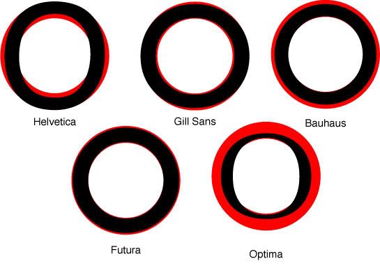
Lauren, surely you're thinking of Futura, not Gill Sans. There aren't any "perfect circles or consistent stroke thicknesses" in Gill.

Not to be contrarian, but it kinda is.... take a look

Gill Sans is overused, congrats on looking around. I actually have the Ultra Bold version in my smei-outdated portfolio but the second I get a free chance I'm going to replace it. (Bernhard Gothic URW Bold will probably do the trick.)
For a replacement, I've been using Avenir. It's one of the few typefaces I started using in college and still use. :)
Benton looks nice...I'll have to try it. Avenir may get bumped aside...
> Not to be contrarian, but it kinda is…. take a look
Actually Chad, if at first glance it looks perfectly round, there have been optical adjustments to the top and bottom curve. They are thinned ever so slightly. The human eye has a tendency to make horizontal stokes look heavier than vertical ones, if they are made mathematically equal.

Neutra needs to be thought of as a strong spice. If what your after is a nice pungent modernist aroma then Neutra is a good choice. And, you can tone it down if you license the entire opentype family by using the text versions with the alternates as opposed to the display versions. But, it isn't humanist it is definitely geometric.
However, if you want something more humanist in a sans, and a little off the beaten humanist path, and still want that pungent aroma, check out Anisette Petite from Porchez Typofonderie
Going down the unexpected grotesque aisle you could check out Amplitude from Font Bureau which is rumored to be expanding its flavor (not) soon (enough).
FF Bau from Font Shop recently gave birth to italics -- not obliques which seem to be more in keeping with grots -- thanks be to the day.
And if you really do like Gill, but hate the little intrinsic quirks that make it annoying -- the lowercase t -- you really should look at Bliss from Jeremy Tankard Typography. And while you are there definitely check out Shaker too.
I'm with Paul on Stainless. I lurv that typeface a little too much.
(I must be hungry)
For some unknown reason the boards seem to be editing my posts. I know that sounds fishy, but it has Christian stumped. Amplitude is from Font Bureau. And the sans that gave birth to italics is FF Bau from FontShop.
Christian, it happened again. :^(
I've been happy recently with the Myriad Pro OpenType that came with Adobe CS.
I stand corrected. Gill is infact a wee bit un-circular. I made the lil graphic to drive the point home.
check it out
p.s is the cursor in the reply box messed up for anyone else...arrgh
ok, ok!
so the O and Q are only 'optically' perfectly round then...
jeez!
but i would argue that – (except for a few kooky places like a and e) -- the stroke thicknesses are in fact quite consistent in gill sans…
certainly more so than futura!
compare b, p, or q for example.
futura takes a geometric approach to the letters, preferring a neat, circular eye (eye? Is that right?) putting the negative space of the stroke a priority over the stroke itself. As a result, the stroke is steeply tapered at points.
gill is more interested in keeping a steady, consistent stroke that, yes, tapers subtlety at joints but quickly restores the established width... in return it’s curves are soft and flabby compared to futura, but the stroke retains it's established thickness much more than futura.
as it's 'geometric sans serif' classification implies, futura certainly has the look going for it, but for some reason i tend to associate the humanist sans, particularly gill sans, with a more mathematical perfection.
that's my story and i'm stickin' with it!
really though, does that make since? i'm curious. or is my untrained eye seeing 'perfect circles and consistent stroke thickness' in places where it doesn't exist?!
I think that's the point of adjusting it, so it "looks" more like a perfect circle :) So since gill is optically adjusted, you could say it's more perfectly circular (or circlear) but technically futura is... si?
and so you know the "eye" of a letterform is a counter… or was it a bowl… nevermind it's one of those. I'll have to dig up my text to confirm.

Well, fontobsession, at least you weren't defaulting to Helvetica or Myriad!
If you were looking for something contemporary to Gill Sans and Futura (before they told you about Neutraface) but different, I would have said Goudy Sans...
Avenir is a great suggestion - like a remix of the best of Futura and the neo-grotesque pattern, but how come nobody mentions the very workable Trade Gothic or Frutiger families in this discussion?
Most clients can be persuaded to see the necessity of an update to Modula or Meta or Officina or even DIN (which I think is still dead fashionable despite having no italics...)
Or how about Syntax, the world's most underrated humanist sans serif?
IMHO, Gill Sans and Futura are the defining faces of the early twentieth century and represent two really contrary ideas about type design. They also came (by overuse) to represent the graphic vernacular of two entire nations; the mid-century joke was 'Q. How do you do British graphic design? A.Set it in Gill Sans and print it in racing green.'
They BOTH use optical adjustment to tweak the letterforms into appearing like they're monoline, but they follow radically different patterns of construction. Each idea has its strengths and weaknesses, which can be revealed by examinining the progression of heavier weights in the family - by the time you get to Gill Elefant or Futura Extra Bold, it should be apparent that neither of them is perfect.

I think that Emigre's new Vista might be a good Gill Sans substitute. Avenir and especially Avenir Next are excellent Futura alternatives, but I might try the Foundry's Architype Renner to get that always desired from the client "exactly the same, but just a little bit different."

I'm surprised nobody mentioned ITC Johnston, what's used in the London Underground. It was created by Edward Johnston, a friend of Eric Gill's. I love Frutiger as well, and I agree with Joe about any LucasFonts, some nice humanist type there.
Hey all, my first post. No one has mentioned it but Twentieth Century by Agfa Monotype is a good replacement as well. It is very similar to Futura in it's build. I use the light, the semi medium, and the semi- bold exclusively out of the font set because the rest of the options feel too disproportionate to me. Check it out.
regards,
AndyBean
And of course, there is Rudolf Koch's Kabel! (try any of the revivals with small x-heights, i.e., not ITC Kabel)
Captured from commoncrawl.org on 21 Apr 2015. original URL