Typophile

node 12597

Well.. Finally, Its me again, lookin’ for an ID.. :)

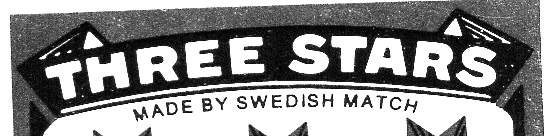
Does someone of you, lovely, fellow Typophiles :), know of any typefaces that may resemble the admireable ‘Three Stars’ ( Swedish Match ) brand / lettering.?

Thank you..

AttachmentSize
threestars.jpg19.09 KB
unknown

It’s somewhat similar to Franklin Wide. I would say it was hand lettered, also.

unknown

Formlos, do you know when the sample was made? Is it recent (bad scan), 50’s, 60’s etc. That info should always be included in a font request, or you will have Ives pulling his hair out of his head. Oops

unknown

Thanks.. Its from a match box.. A recent ( bad ) scan, but also a vintage logotype.. ( According to www.swedishmatch.com.: ‘..Three Stars is a 120 year old, truly international brand, originating from the Joenkoeping Westra match factory in Sweden..’ ) But, I am not too sure about the age of the actual sampled logotype / lettering..

unknown

My guess is being a match company they haven’t had to change their idenity and I’d bet its pre-digital. So I’d have to go with Mark’s suggestion as a starting point. Place the scan in illustrator, set it in Fanklin Wide and start moving some of the points around.

unknown

> they haven’t had to change their idenity

Really? I would point out that fire has acquired an increasingly bad reputation over the 20th century, so a redesign some time over the past decade or two isn’t far fetched. That’s why “safety matches” (ones that don’t light?!) were invented after all…

hhp

unknown

The concept of a safety match seems slightly redundant to me.

unknown

… as seems the concept of friendly fire.

Captured from web.archive.org on 4 May 2006. view this capture