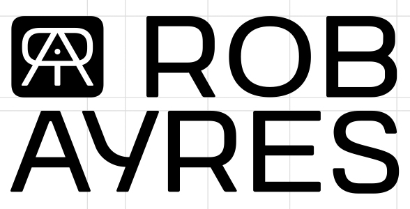
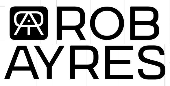
My client (Robert Ayres) freelances as a stylist and makeup artist.
He also does his own photography, with focus on weddings.
He has used the logo icon (which I created a couple of years ago) as
Ayres Creative,
Recently he has decided that it would be better to push his name (which as
a great reputation in the field). Business was re-named Rob Ayres (the "creative" was dropped).
I am revamping the old type work which was done using Lineto's Normetica
font (which I will continue to use in associaterd text). I am thinking that in
fashion, simple sans serif in a light to medium weight and wide seems to works well.
I like to openness of the design, with the large counters, and alternates.
I am having issues with balancing everything, as well as choosing the best characters.
I have done several Y's (unicase and standard caps), target-shaped geometric O's
and an alternate O with has larger counter. There was alternates A's designed
as well. I will post my a few designs.
| Attachment | Size |
|---|---|
| RobAyres1.jpg | 69.72 KB |
| RobAyres2.jpg | 67.3 KB |