
Any font ID, headline or body text, would be appreciated!
Any font ID, headline or body text, would be appreciated!

The italic in the headline looks like a modified version of Charter ITC italic. The lowercase y for example between the two looks rather different while many other characters are very close. Not too sure on the body copy though.
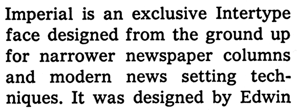
'Franklin Gothic', by Morris Fuller Benton, ( Custom ) 'NY Cheltenham', by Matthew Carter, and, 'Imperial', by Edwin W Shaar.?
If I recall a specially drawn version of Cheltenham was created for The New York Times. I will guess (without looking at any spec books) that its the italic version of that redraw.

I'd say that bit at the top is probably handdrawn (ballpoint)...
How about the actual body text? Could anyone tell me that?
Well.. Sure.. ‘Imperial’, by Edwin W Shaar.? :)
So it is.... oops :)
Imperial is close, but no cigar. Look at g and s in the Times copy vs. that of Imperial. Clearly different.

It is Imperial, just not Bitstream’s digitization of Imperial. The version the Times uses is closer to the original.
Captured from web.archive.org on 1 Jan 2015. view this capture
