hello
im a newbie concerning typography and also not really sure if i post this in right place :) just move it if not.
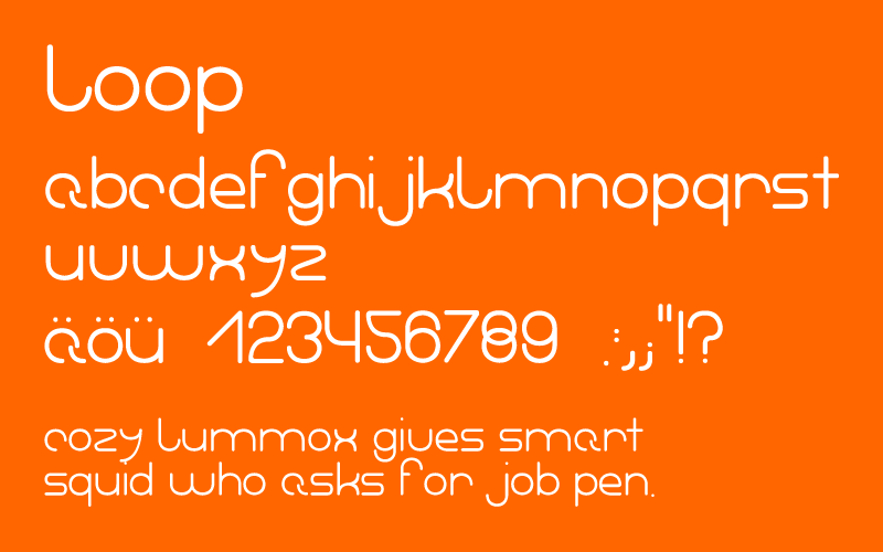
im still working on the font, kerning/spacing is not really perfect, but in general: what do you think of it?
its nothing revolutionary, doing such things just helps to get experience..
| Attachment | Size |
|---|---|
| loop3.gif | 17.51 KB |