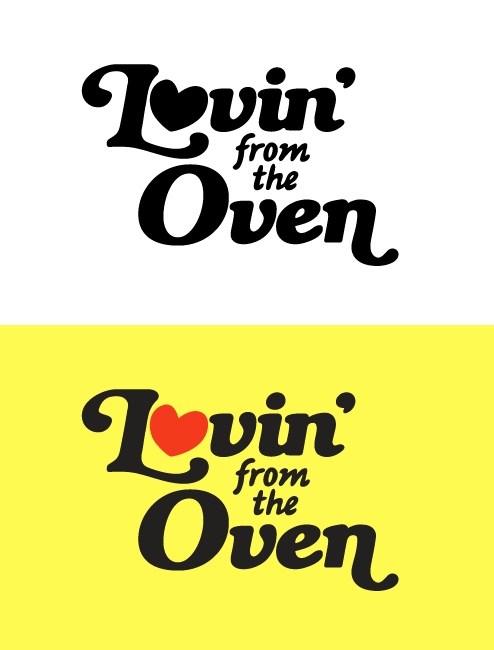
hey guys, I'm new to the forums, been a fan of Typophile for a while.. I'm looking for constructive comments to this logo. The direction is final and I know it's a pretty obvious solution (the client jumped on one of the early directions. The logo is for a young, female independent caterer with a distinct style. She wanted something 'groovy' and something that would set her apart from the corporate-ish caterers in town. The main type is based from Bookman w/ swashes and the 'from the' is hand drawn. Any suggestions/crits are more than welcome. thanks!
| Attachment | Size |
|---|---|
| lovecomp.gif | 11.06 KB |