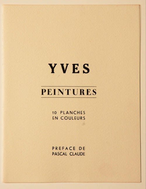
Looking for an ID on all three of these beauties: 'YVES', 'PEINTURES', and the sans serif used for '10 PLANCHES EN COULEURS'
Any help would be greatly appreciated!
Danny

| Attachment | Size |
|---|---|
| tumblr_mor8wsWYh41qhtoslo1_500.png | 413.07 KB |
Looking for an ID on all three of these beauties: 'YVES', 'PEINTURES', and the sans serif used for '10 PLANCHES EN COULEURS'
Any help would be greatly appreciated!
Danny
| Attachment | Size |
|---|---|
| tumblr_mor8wsWYh41qhtoslo1_500.png | 413.07 KB |
Since the publication dates from 1954, we are dealing with metal type here (phototypesetting was just beginning to take off in that year).
|YVES| appears to be Sorbonne Medium:
http://www.myfonts.com/fonts/berthold/sorbonne-bq/
|PEINTURES| is a variation on Didot, but I haven’t located a spot-on match. Didot Headline Bold may work:
http://www.myfonts.com/fonts/canadatype/didot-headline/
|10 PLANCHES EN COULEURS| could be recreated using something like Titano B:
http://www.studiodilena.com/it/titano.html
i'm amazed. thank you so much!
Captured from web.archive.org on 20 Apr 2015. view this capture