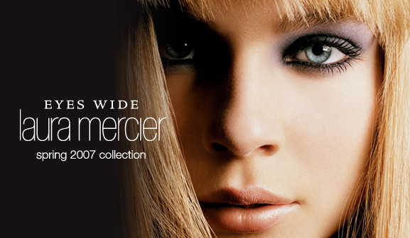
EYES WIDE font.
sorry, but this is the bigger picture I could get, I hope you can help me.
https://makeupandbeautyblog.files.wordpress.com/2007/03/laura-mercier-ey...
EYES WIDE font.
sorry, but this is the bigger picture I could get, I hope you can help me.
https://makeupandbeautyblog.files.wordpress.com/2007/03/laura-mercier-ey...

Too small for me to say for certain. Perhaps there is information from Berard Associates, the firm that was responsible for Laura Mercier logo brand identity design / Berard Associates the http://berardassociates.com/laura-mercier-color-line/
Don
As for the logotype for _laura mercier_, it looks like a modified version of neue Helvetica® Std 27 Ultra Light Condensed http://www.fonts.com/font/adobe/neue-helvetica/27-ultra-light-condensed. Main difference is that _a_ has had is tail clipped. A classic example of logo-making 101 -- take a retail font, clip something from a letter and cash a big cheque.
Don

It looks like http://Adobe Jenson Pro (Caption)
RE: don... Thanks so much Don
RE: fvilanakis... apparently is very close, thanks!
Captured from web.archive.org on 18 Aug 2017. view this capture