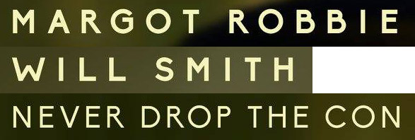
I found this one on the teaser poster for Focus. Besides the very high waist of the B, G, P & R the awkward W and narrow M throw me off. Looks like either a vintage geometric sans or a freeware/Google font.
Font:
Biko
Solved By:
| Attachment | Size |
|---|---|
| Focus_type.jpg | 30.68 KB |