Typophile

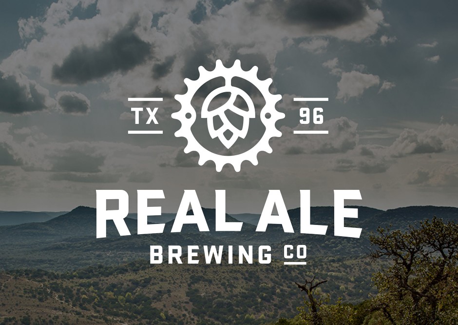
Real Ale

elabdesigns

It appears to be a modified version of Stratum. However the type also appears in other materials as well, not just the logo, which leads me to think a typeface exist. It's like Stratum and Serpentine have been merged together.

Has it just been modified or does a typeface exist?

AttachmentSize
BBros_Real_Ale_02_NewLogo-940x666.jpg128.5 KB

Definitely based on Stratum 1 (this /W and those numerals can't lie) and massively used on their website with Vonness Condensed. I also don't know any "Stratum-like with flare serifs" like they did. You may like some fonts by Mattox Shuller of Fort Foundry like Industry, Industry Inc. and Gin (some sort of "condensed Stratum-like with latin serifs") that looks pretty appropriated for such branding identity.
Some more but far less close: Boucherie/Charcuterie Block, Burford, Brothers, Dealers, Braingelt, LHF's Roebuck, Antique Half Block and Old Stock, Reidfork, Wooderson, Page Ephesian, Companion League

Captured from web.archive.org on 26 Apr 2015. view this capture