
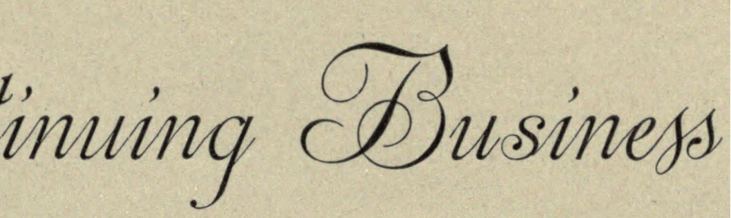
Anyone know the name of the script type and who designed it?

Font:
Sansom Script
| Attachment | Size |
|---|---|
| Script.png | 434.53 KB |
Anyone know the name of the script type and who designed it?
| Attachment | Size |
|---|---|
| Script.png | 434.53 KB |
The image sample above shows 3 versions of 's', 2 of them mostly are alternates but I have not come across any script faces that looks like this...

Some similarity to Dorchester Script http://www.identifont.com/find?font=Dorchester+Script&q=Go A visiting card script designed by Monotype in 1938. The previous year Monotype produced Grosvenor Script, which is similar but with short descenders.
UPDATED INFO:
Luc Devroye comments on Dorchester Scrip:
"Script, issued in 1938 by Monotype, based on a Grover Foundry script found in Ichabod Dawkes's News Letter from 1698. "
Don
UPDATED:
This class of became popular as metal type from the late 19th century, such as BB&S's Stationers Semiscript of 1889. It is revived by Canada Type as Siren Script http://www.myfonts.com/fonts/canadatype/siren-script/ Many variations were made.
Don
Thanks for all the information Don.
I finally found the original source of the image:
https://archive.org/stream/specimensofprint00mackrich#page/36/mode/2up
Looks like the name is called "Sansom Script". Searching at Luc Devroye site turns out the typeface was designed by Hermann Ihlenburg
http://luc.devroye.org/fonts-38296.html
Doesn't seem to have any digital version available
It's been several years since I went through the MS&J Specimen Book of 1892, but now that you mention it I do recall seeing the display of Sansom Script.
Note that the practice of the day was to show the font in use and not provide a full character set. So it's necessary to use imagination to see the shapes of characters not included in the presentation.
I considered the idea of making a digital version. I tracked down the patent. Despite the poor quality of the patent image -- bureaucratic masterminds in the Patent Office made crappy quality microfilm of the patent applications and trashed the originals so that this was all that was available for the recent digitization of patent records -- it at least shows the general outlines of the characters not included in the specimen Book. I extracted the full character set and rearranged the letters into shorter lines at are easier to assess.

BTW it is possible to digitize Hermann Ihlenburg's fancy scripts. See the excellent treatment of his Centennial Script by Rebecca Alaccari for Canada Type http://www.myfonts.com/fonts/canadatype/centennial-script/ The original metal type of these scripts was extremely fragile and printed text other than the ones in the Specimen Book often show broken, bent or missing connecting lines. It is only with the arrival of digital type that they can be widely used.
Don

Nice work Don. Thanks for the digging.
- Mike Yanega
Captured from web.archive.org on 14 Apr 2015. view this capture
The connections remind me of metal type.
Do you have any information about about your sample, i.e. where and when it appeared?
The final _ss_ seems to be a ligature.
Don