
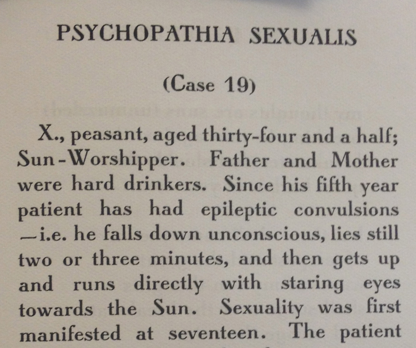
OK, here's what I can find....
The font in the picture has not been identified. It does, however, have many quirky characters which the old metal face Grasset (Deberny & Peignot, 1898; ATF, 1904; and Monotype, 1912) has in common. The overall look is very similar.
I suspect the font in the picture is based on Grasset -- or the other way around. Grasset is not available in digital form under that name that I could find, but there are two digital versions under other names.
Octavian, at http://www.myfonts.com/search/octavian/fonts/ (not a very good version -- look at the lowercase /t -- it is way over-size)
Grantham, free download at http://www.moorstation.org/typoasis/designers/lloyd/grantham.htm. This appears to be a pretty good version and should at least give you the appearance you are looking for.
Unless, of course, you are wishing to digitize the font in the picture. If that is the case, you still have to identify it and find a usable specimen of it.
The book is Sleeping Together, by Harry Crosby, published by Black Sun Press in 1929 in Paris. I'll look into the typefaces you recommend.
Some good approximations but I'm looking to get something that best matches that extended crossbar on the cap A.
Hmm. That title is not in a list of Black Sun's works.
Is the entire book set in that font?

I think Louvaine, designed in 1928 and issued in 1929, but did not last long enough to appear in the 1934 ATF catalog, is closer than Grasset. Consider Louvaine Medium:

The a plumb-line, vertically-stemmed _y_ tail was a feature of some pre 1917 century Cyrillic fonts

Why it might not appear in the Black Sun catalog is that it is volume 3 of Collected Works. It's that distinctive extended crossbar on the cap A that's critical.
Title: Sleeping together; a book of dreams.
Attribution: With a memory of the poet by Stuart Gilbert.
Author / Creator: Crosby, Harry, 1898-1929.
Published: Paris, Black Sun Press, 1931.
Description: 65, ix p. port. 23 cm.
Language: English
Author / Creator: Crosby, Harry, 1898-1929. Collected poems, v.3.
Series: His Collected poems, v.3
Creation Date: 1931
HOLLIS Number: 005073186
Permalink: http://id.lib.harvard.edu/aleph/005073186/catalog
Source: HVD ALEPH
Might be a lead in this account of the Black Sun Press:
---start quote---
Started in 1927 by Harry and Caresse Crosby ... young expatriates living in Paris, the Black Sun Press was created to publish its founders’ ... attempts at verse in beautifully bound, hand set books. ... the Crosbys found Roger Lescaret, a "master printer" whose previous works had been primarily funeral notices, to print Harry’s poems in a fine edition. They were so delighted at the result, Red Skeletons, with illustrations by their friend Alastair [the professional name of Hans Henning von Voight], that they decided to found a press. In a typical combination of high ideals and deflating humor, it was first called Éditions Narcisse – after their black whippet, Narcisse Noir.
---end quote---
http://www.english.illinois.edu/maps/poets/a_f/crosby/blacksun.htm
So perhaps a bespoke typeface for or by Roger Lescaret.
Don
Another example of the BSP font, perhaps including an italic http://www.english.illinois.edu/maps/poets/a_f/crane/blacksun.htm
Don
Also perhaps the italic for the BSP font http://commons.wikimedia.org/wiki/File:Prospectus_of_James_Joyce%27s_Col...
Don
It's very strange to me that the content shown in the image would appear in a "collected works" volume, even more so because Mr. Crosby did not write the content shown.
Aside from that, if it is only the /A that is critical, why not use Grantham and ask someone to modify the /A for you, or download FontForge (free font editor) and do it yourself? Since Grantham is a free font, I'm sure the license will allow you to do that if you don't plan on redistributing the font.
I agree with Don that perhaps the font in question was never a commercial font.
Mr. Thomas, I assure you that Harry Crosby wrote the material in the photograph. It is from his book Chariots of the Sun (http://www.poemhunter.com/poem/psycopathia-sexualis/). I apologize because I inadvertently used the photograph of that page thinking that it was from his book Sleeping Together. Both use the same typeface. My assistant took the photo and I forgot that I had instructed her to photograph all prose poems that were not included in Sleeping Together. (See: http://www.amazon.com/The-Collected-Poems-Harry-Crosby/dp/B004CULP6M.)
Information from everyone has been extremely helpful. I was hoping that the typeface would be commercially available. Looks like it was a minor early 20th century typeface that was probably not used for much bookwork since Lescaret did not primarily focus on books. If I want to use that typeface for my press, I'll have to make alterations to an existing similar typeface that has an open license. All those leads above on similar typefaces are very helpful and I again thank Mr Thomas and Don for their expertise.

I wouldn't hold out hope that this face is commercially available. To my eye, it's a real dog's dinner of a typeface, combining elements of Grasset, Louvaine, Bewick Roman and Graybar Book, without really resolving the differences among them.
Good point. No disputing that the typeface verges on Frankenfontism. The most striking feature is the pregnant _S_ and _s_, but this is not reconciled with other features such as the Louvainesque feature of making the thicks and thins meet at an angle, the German single story _g_, the Didotesque _y_ with the plumb drop vertical descender, and some of the quirky touches in the styles of Grasset, Bewick Roman and Graybar Book.
However, perhaps it was appropriate for a press that dealt with topics that were far from conventional.
Don

I agree with Nick. I hunted in all my books and Graybar/Louvaine are the closest I could find. A problem is that Lescaret may have used an existing (but obscure to us) French typeface. I don't know about you guys, but my collection of information about European types is pretty sketchy. (I searched McGrew's book, in case it was an American type, but I didn't see it.) Then I suppose there is also the possibility that he may have developed his own typeface, but if he did he escaped the notice of Luc Devroye. That makes me suspect he used something that was available to him, but perhaps from an obscure foundry.
- Mike Yanega
The production runs were very short, so I believe that this is a letterpress font rather than something that meets the technical specs for a typecasting machine like Linotype. So I wouldn't rule out bespoke.
Private presses in the early 20th century with aspirations to uniqueness sometimes made the effort to have a unique typeface. Recall for example the Doves Press. In these cases vanity trumped profitability.
Might be worth a search of the books on private presses to see if there is anything on Black Sun Press.
for example Hugh Ford's _Published in Paris: American and British writers, printers, and publishers in Paris, 1920-1939 [1975]_ http://www.amazon.com/Published-Paris-American-publishers-1920-1939/dp/0... I trust there are others. For more leads Google "Paris private presses black sun" or visit a good university library and check their holdings for LOC classification Z321 and nearby.
Don
Captured from web.archive.org on 15 Apr 2015. view this capture

Are you certain the book was published by Black Sun? It is not listed in their body of works. Mr. Crosby did own a copy of the first English translation of Krafft-Ebing's "Psychopathia Sexualis", Rebman, London 1905, but I see no evidence he ever reprinted it. Frankly its content does not fit within the scope of what they normally published.
All that being said, you still want to know the font. Knowing where it was published and by whom might make identification a bit easier.