
Hoping for an ID on the numerals in the 3 smaller dark brown circles...That 4 is curious... Thanks you!
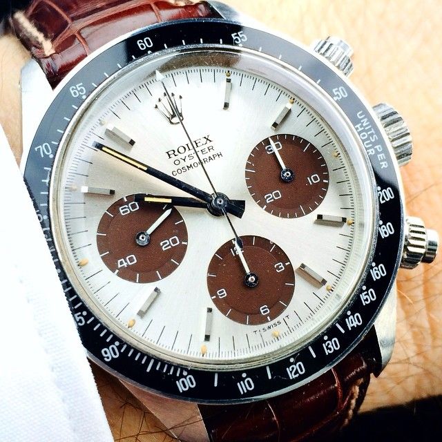
Font:
Close to "Rexlia"
Solved By:
Hoping for an ID on the numerals in the 3 smaller dark brown circles...That 4 is curious... Thanks you!
That’s because it appears to be custom.
Closest commercial typeface is Eurostile (Extended or Extended Semibold should do the trick):
http://www.myfonts.com/fonts/linotype/eurostile-next/
You’ll have to customize the |4| to match, or pick it up from this typeface:
http://www.myfonts.com/fonts/typodermic/rexlia/
Agree twice with Kevin. Most probably exclusive and proprietary of Rolex and definitely very close to 'Eurostile Extended/Microgramma'. From what I can see, 2 main differences but easily redoable:
- /1: top-bar-less
- /4: top with extended flat section
Some more "Eurostile-Extended-like" clients for customization: House Gothic 23 Extended, Forza, Myers Sans, From The Stars, Latin counterpart of Arian (variation on Eurostile Extended), Bitsumishi, Miedinger (probably my choice here), Metro DF, Geom Graphic (nice too)
Just came across this one, Manifold by Connary Fagen would also be a good option simply closing /4 (and removing /1 top bar).
Awesome thank you kthomps5 and Ryuk
Captured from web.archive.org on 17 Mar 2015. view this capture