Typophile

Gidolinya

andreaslarsen0 votes

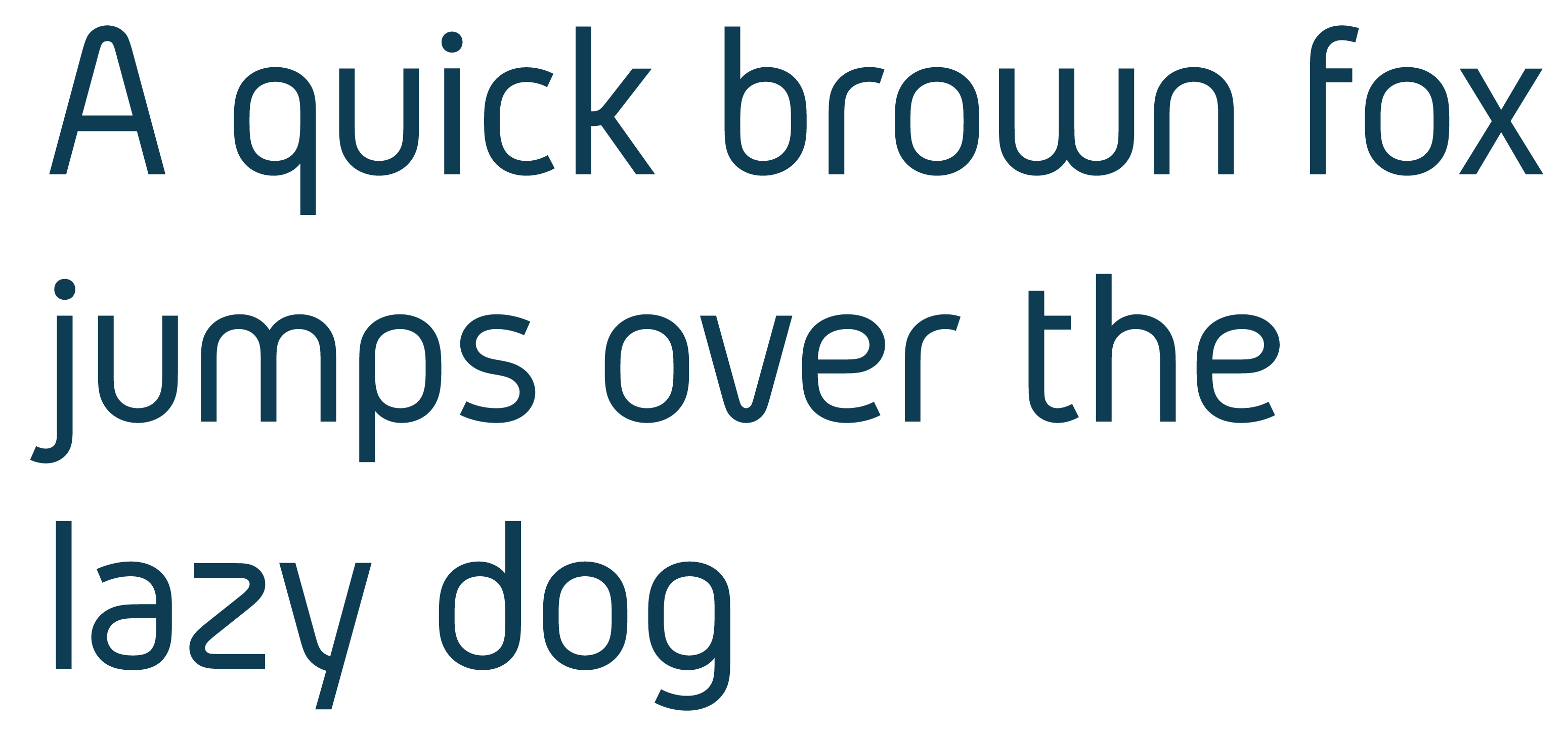
I started making alternates for Gidole and as someone also pointed out in that thread it looked more like a separate font.
So I made it into it's own font (borrowing some characters from Gidole) and would love some feedback.

More screenshots over at: https://www.behance.net/gallery/23391815/Gidolinya-Free-Typeface

The bowl of /p and, to a lesser degree, /q, looks like it's leaning backwards.

I'm not convinced of the flattish bottoms of /b /d.

The /m and /w look somewhat asymmetric; I think the apex of the second arch in /m and first arch in /w might not be centered. Maybe even the two arches are of different widths?

The /f and /t still strike me as too narrow.

Hi, thanks for the great feedback again

I wasn't happy with p,q,d,b either but they are difficult to master because it should look somewhat symmetrical and effortless but still be balanced. It's especially difficult width g,p,q because I want to accentuate the corner were the stem is cut of but that causes them to lean a little bit so it's a matter of finding the right compromise.

m+w were perfectly symmetrical (photoshop rendering isn't always 100% accurate) but now I've tried making the m asymmetrical (apex, not width).

I've also made f+t a bit wider

http://typophile.com/files/gidolinya_6224.png

The joins of /g and similar ones are heavy; you should do an optical compensation. The /w is very flat compared to the /v, and I think it could use a nice angle.

Thank you for the feedback. The joins were already thinned but I think i thinned them even more in the latest version.
Problem with /w is that my attempts on designing it like the /v has resulted in the /w being too wide.

Latest update:

Captured from web.archive.org on 11 Sep 2019. view this capture