Typophile

Type Made for Kerning

John Savard

A thought struck me today; during the era of hot metal type, why is it that no one ever invented the following -

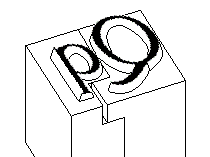
Since the kerns for letters like j and Q in some typefaces are very fragile, why couldn't they have been made more durable by a strategem like the following:

In the area of a type slug below the baseline, for characters without descenders, cut a groove into the shoulder of the type, or lower the shoulder, so that there is room to put a reinforcing base below kerns.

Or simply make the shoulder lower everywhere, so that the part of the type that is in the shape of the particular letter is deeper and hence stronger.

In the case of letters with descenders that are on only one side of the letter, like p and q, the groove or lowering of the shoulder should still be present on the side the descender does not occupy.

An interesting exercise in hindsight!
It would make things clearer if you illustrate your idea with a diagram.

I agree that a diagram would help, but I felt it would be difficult for me to prepare one. But here we are:

This shows a kerned Qq in Garamond, with the downwards step in the shoulder on the q only going part way across since that letter has a descender.

I suspect that it would be cheaper to cast replacement sorts than to cast a whole font that way.

Nice idea and drawing it reminds me of traditional Japanese carpentry joints. Now put it in a time machine and send it back to when it can do most good.

I am full of obsolete inventions.

Back before laser printers, mainframe computers used big line printers to produce lots of output on paper quickly. Some used a rotating drum, with all the characters provided repeated at each character position, with a hammer at each character position forcing the paper and a ribbon against the raised character.

Others used a means of moving the characters across the page, so that only one (or a few, since the width of the page would be 132 characters, while usually 64 different characters or less could be printed - but in this case, unlike the drum printer, the characters were often spaced apart by more than the size of a column on the page) copy of each character would be needed.

Of these printers, some used a flexible band, some used a chain of linked slugs with characters, and others used a print train where the hammer pushed a slug that could move forwards to the paper.

If the hammer hit at a slightly wrong time, for a drum paper the line was wavy, with letters displaced up and down; for one of these printers, the character would be moved to the right or left.

Well, the thought struck me that this could be exploited, and a line printer could be made (with extra-wide hammers that would have to be able to be displaced horizontally into more than one position) that could do proportional spacing. Perhaps only crudely, like an IBM Executive typewriter.

And as it happened, IBM made a line printer that moved the characters horizontally, but which used a solid bar with the characters rather than a band or belt or train.

That gave me the idea of using a print drum that moved horizontally to present each character to each print position for printing, and which rotated to make a different character set available.

An impact line printer that could print in Chinese? Along with doing, say, four-line mathematics?

I guess before letterpress became a more revered form of art, foundries were just too lazy or didn’t want to spend more time and energy producing kerned type. I’ve seen wood type being kerned by saws, but rarely with metal text faces. I’ve seen metal initials being kerned though.

Or you could cast the letterform out of the face. ATF Garamont I worked with has its italic /f letterform protrude out of the rectangular face. That’s extra annoyance in the composing stick because you have to carefully sneak other letters under, but the /f is definitely kerned more in.

@quadibloc - "I am full of obsolete inventions."
Tell me about it. I spent years developing a perspective-drawing machine, just when the PC started becoming popular and could draw such scenes. In other cases I would get an idea, jot a few pages of notes and go to the next thing. One such idea of 1983 was for super-resolved microscopy using time-resolved florescence. The idea, but not me, got the 2014 Nobel prize in chemistry!

As to protruding letters these days most modern Arabic fonts redesign the ra ر to descend vertically downwards and not cause trouble conflicting with the next letter ريا I had to spend months learning how to use OT features to adjust the dots of the next letter but did not change the ra shape.

Vladimir Tamari > I had to spend months learning how to use OT features to adjust the dots of the next letter but did not change the ra shape.

@ Move/change ra shape and/or move/rotate dots easily with QB! http://typophile.com/node/120811

I've never liked being the bearer of bad news, but...

Your pictures mostly show conventional kerned type, except in the case of the capital TA, were we see mortised type.

I'm saying that conventional kerned type was recognized historically as being awfully fragile.

One way to deal with it would be simply to make the "letter" part of the type deeper, and the "block" part of the type shallower - that wouldn't change the nature of the kern, only the proportions of the type body, but it would make the kern tougher.

Yes, though, the "letter" still does have a bit of a base on it that's above shoulder height. But I'm suggesting drastically thickening that base and lowering that shoulder.

I see what you mean. I should have read more carefully.

Just speculation, but could these mortised bodies be a bit awkward in the sense that they might need to be cast to fit specific letter combinations? The size and shape of the notch needed for, say, a TA might be different from a T—. In other words, it might be just as efficient and less troublesome to cast these particular pairings into a single body (a ligature, of sorts, I suppose).

Also since kerns were mostly reserved for display sizes where even spacing throughout the line of type would be most noticeable, slug bodies that fit together a bit like jigsaw puzzle pieces might not work with the usual quad spacers.

Again, though, just speculation. I really have no idea.

Well, just as the type would have to be modified, so would the quads and spaces - they would have to be shortened, to only reach to the level of the troughs that make room for kerns.

Captured from web.archive.org on 17 Mar 2015. view this capture