
Typophile
Serif Font
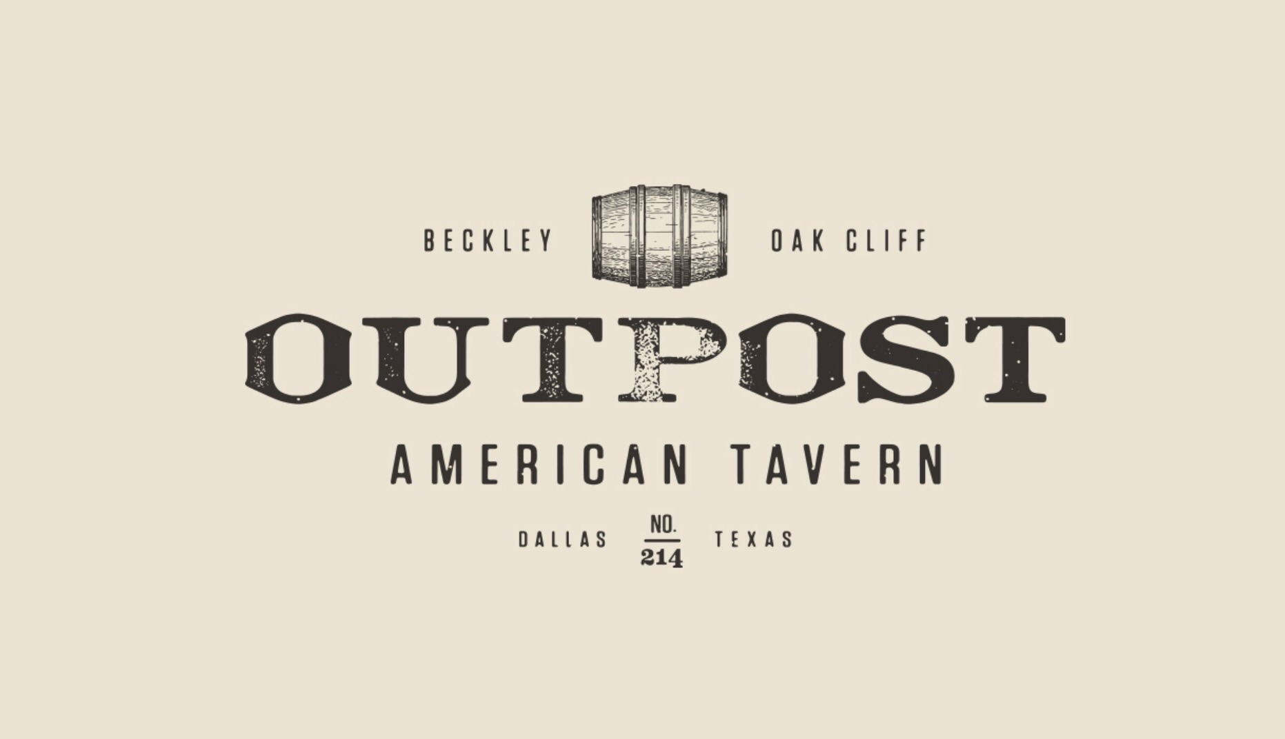
Confirming your hunch, not a font to me as well, rather a custom logo work and possibly heavily customized.
I'd probably start with Sackers Roman Heavy:
- adding an outline stroke to embolden it and to round corners
- reconstruct /O (the only real custom part of this logo to me) from /U left spurred quarter, mirroring vertically once, merging the 2 parts, mirroring horizontally, merging, done
- add a rough/grunge/eroded/vintage post-treatment: the 2 /T treatments are different meaning the lettering has been treated globally and does indicate the lettering does not come treated
Ryuk, you are right on with that. Very helpful. Did the MyFonts "what the font" feature work to ID this font?
No, haven't used it for years and notoriously un-accurate (potentially part of their business model). I use only WhatFontiS when I lack alternative suggestions and it has always been of a big help.
This spurred /U was the earmark and rang the bell of Sackers Roman. /S looked also very close so decided to share my thought about it.
Captured from web.archive.org on 17 Mar 2015. view this capture