Typophile

Narrow Modern Oxford University Press 2004

Donald H. Tucker

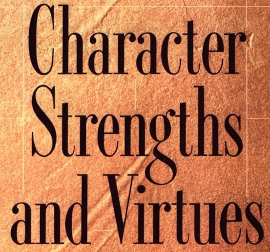
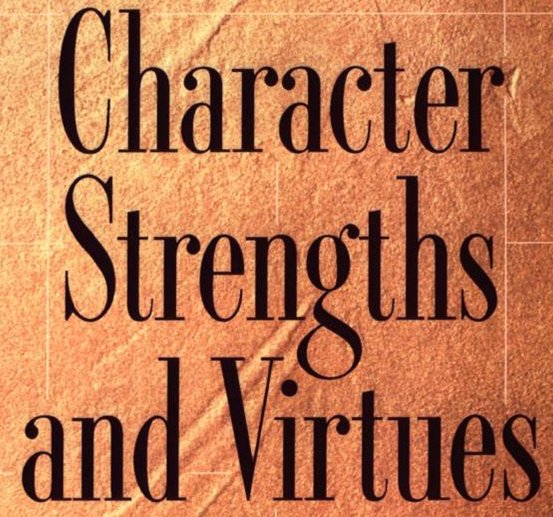
This is from the cover of _Character Strengths and Virtues: A Handbook and Classification_ By Christopher Peterson, Martin Seligman, Oxford University Press 2004
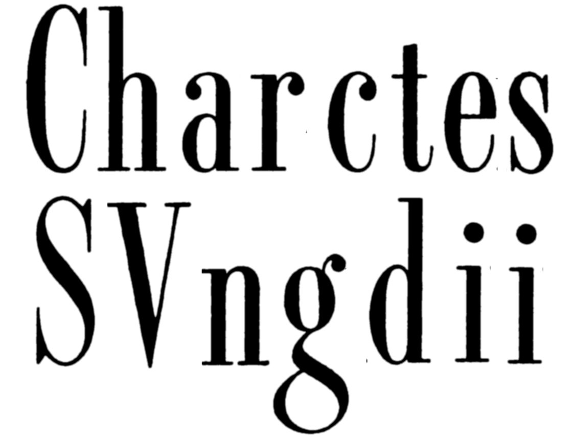
I cleaned up the letters
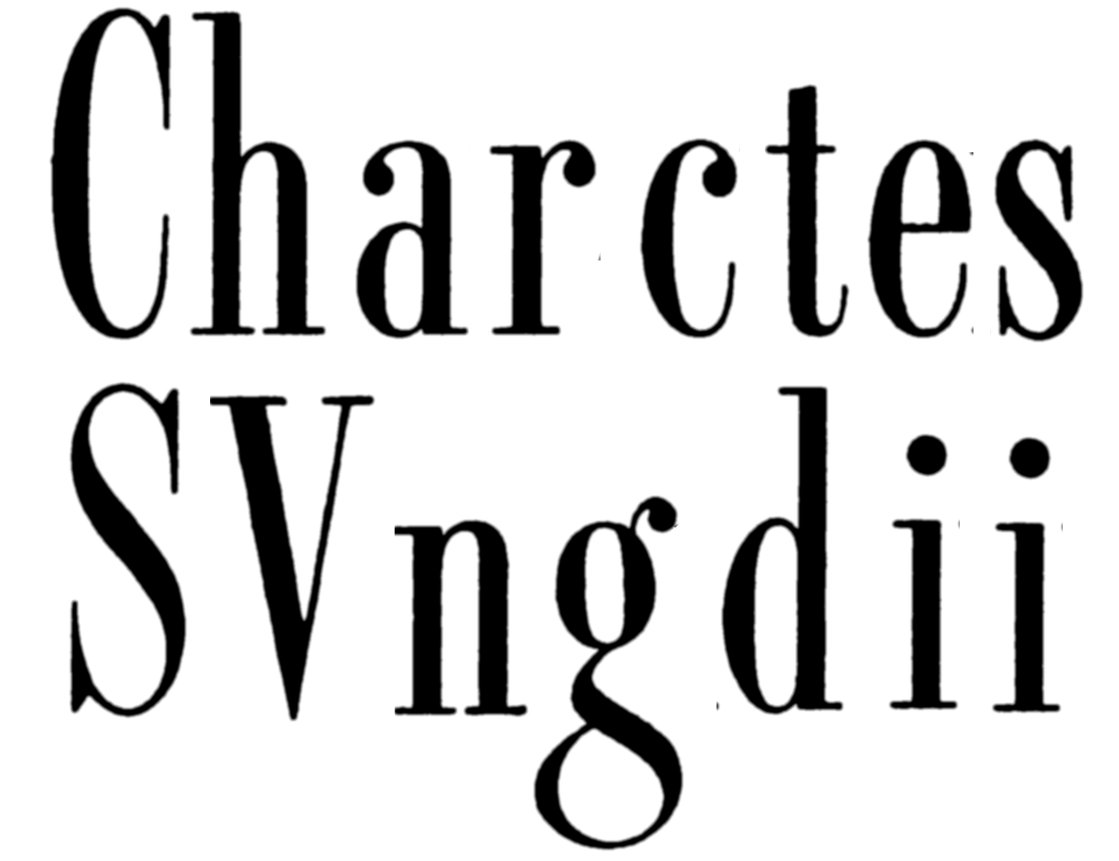
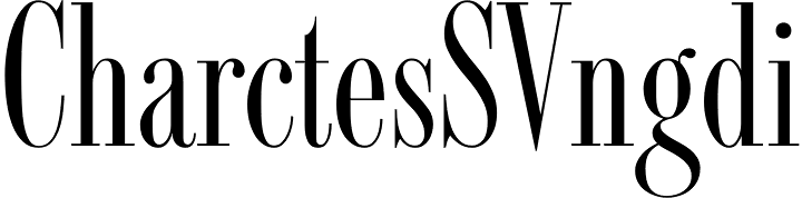
and sent them to What The Font. Its closest suggestion was Bob Alonso's Fashion Didot
https://www.myfonts.com/fonts/bagraphics/fashion-didot/

Close, but not a match.

Any suggestions?

Thanks Don

Font: 
Racer
Solved By: 
AttachmentSize
_UnknownNarrowSerifOrig.jpg86.69 KB
_UnknownNarrowSerifSM3.jpg59.75 KB

OptiRacer/ORACER by CastCraft

Download Link:
http://opti.netii.net/fonts-r/index.htm

Thank you. This is indeed an exact match.
According to the note for the OPTI font it was "Originally a phototype by Filmotype."
Unless there was a version with the same digital outlines by another fontmaker before OPTI produced OPTI Racer, this is presumably an original digital creation by OPTI.
Does anyone know of a matching digital font before the OPTI font?
I only ask because of of the notorious reputation of OPTI/Castcraft as a forger of unauthorized clones of digital fonts. A relatively small proportion of its fonts were original digital creations.
Don

Not much help, but I can confirm from Filmotype catalog showings that this was originally Filmotype Racer. I know of no other digital versions.

Stuart Sandler bought the rights to the Filmotype collection in 2006 and has since been having several fontmakers create digital versions for sale. No Racer yet, though.

Thanks Mike for the confirmation that the OPTI Racer is indeed based on a Filmotype font with the name of Racer.
As far as the fonts being created by Stuart Sandler's people from the Filmotype archives, I trust you will agree that the current rate of production is very slow -- only six fonts were released in 2014. https://www.myfonts.com/foundry/Filmotype/?sort=new
Don

I certainly would agree, Don. And the 69 fonts digitized thus far make it clear that nobody is racing to produce the more generic sans or serifs.

I was just wanting to clarify for anyone accessing this thread in the future and wanting to use a font like this commercially that Filmotype isn't defunct; the legitimate rights belong to Stuart Sandler.

By the way, I appreciate the fact that Sandler and colleagues are including the batch of alternates that most Filmotype fonts had.

Mike, looking at the example of Racer, we have a design that Oxford University Press choose as the best way of expressing its title theme. I don't know whether OUP used the OPTI digital or a Filmotype analog source.

I find the Racer typeface design superior to Fashion Didot for this purpose.

Anyone trying something similar for a commercial project today would be stuck in the bind of using a digital font from OPTI -- an orphan foundry where there is no way of obtaining appropriate intellectual property permissions -- or making the font from scratch.

I do hope that Stuart Sandler's digitization plan has Racer in the next batch.

Cheers.

Don

Should give credit for the find. Unfortunately Mike, I can only give it to one person.
Don

Good content as you did! This post is absolutely savored and I prefer to stay up always for the proven reading.
Please Visit Avengers jacket: http://desertleather.com/Iron-Man-The-Avengers-Age-Of-Ultron-Leathr-Jacket

It's totally amazing overall..Really have an outstanding day. I look forward to hearing much more by Author. good going Man!
http://www.filmstarlook.com/product/avengers-age-of-ultron-scarlett-joha...

Captured from web.archive.org on 17 Mar 2015. view this capture