Typophile

TransType 4 is great but I do not want it to autohint webfonts.

Vladimir Tamari

Hi - I bought TransType 4 and am very happy with its functions. It lists the fonts nicely, converts ttf into otf and lets you overlap the fonts over each other in colored transparencies for checking, etc. With the click of a button it creates all the files woff, eot, etc. needed for webfonts. It also autohints the webfonts without being asked! I did not check the quality of the autohinting in the Latin characters, but I definitely do not want it in the Arabic glyphs. Is there a way to delete this function? Or to remove hinting from relevant file(s) in the finished webfont folder? Thanks.

For TTFs, ttfautohint has an option to strip all hinting from the font.

Apologies!! The autohinting happens when converting TTF to OTF not for webfonts! Perhaps a clearer head than mine can confirm that. Anyway it would be great if TransType gives you a choice in its preferences about autohinting. Now how to remove hinting from OT? Thanks.

I'm sure there must be some way to automate that, but I don't know of a simple one without introducing scripting or other commercial tools.

I am curious... so, you dislike the effect of the autohinting on the Arabic, and want it unhinted instead? In what rendering environments is it better?

Thanks Thomas
wish I had extensive experience in hinting / unhinting to justify my preference for unhinted Arabic. An experienced Arabic type designer and another well-versed in under-the hood programming advised against it. The latter did not like how it ironed out quirky details in his Latin font. For myself I experimented for a while with Fontlab's autohinting, looked at the hinting waterfall effect and saw drastic distortions as size diminishes. The dots, essential information carriers in half the Arabic letters in particular suffer the most.
Something related I often wondered about - are there hybrid fonts whereby an outline font functions normall but then a pixel font kicks in and displays below a given small size?

Currently, just about all rendering environments ignore the bitmaps in such hybrid fonts. So, functionally, no.

I'd like it if you could send me an example of an autohinted font that's performing badly. I'd like to look at the hints. But broadly speaking, FontLab's autohinter for PostScript outlines is pretty darn good. It's only a tiny bit behind the Adobe PS autohinter, which is the gold standard.

Also, as an aside (and not meant to sidestep the issue): why are you creating OTF from TTF for webfonts? Is it because you can get smaller sizes out of them?

Hi Thomas
Too bad about hybrid fonts - it would seem an ideal solution for tiny texts.
I apologise for the misleading topic headline. Perhaps I have waded in too deep and above my head into these technicalities!

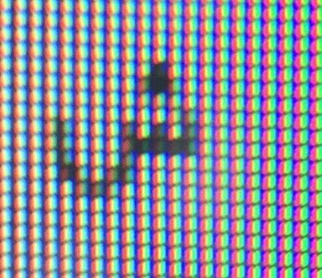
I guessed perhaps wrongly that FL's autohinter is fine-tuned to Latin script with its well-defined Asc and Desc and x heights. Arabic outlines go all over the place. In Arabic my main concern was the dots - which are the only way to distinguish various letters in half the alphabet! A dots should reduce to a single well-defined pixels at minimum size. The autohinter however turned two dots, for example into two lines at an angle, or made three dots stick together into one square as in the example below.

I like OT because it preserves the PS outlines with which I designed my fonts in the belief - again perhaps mistaken - that that will better preserve them on display.

The two images are of the same letter - a direct photo of the screen of the unhinted glyph displayed in Text Edit at 10 points is more or less recognisable. The Fontlab screenshot of the TT hinting of the same letter the three dots and three 'teeth' become unrecognisable. It would be wonderful if this can be improved. Thanks.

Vladimir

I could have sworn you said you didn't like the PS hinting in FontLab, but you're showing the TT hinting.

I'd also be curious to know whether adding a blue zone at the height of those three stems would help.

T

Thomas -

Right. I am learning bout hinting as I go along - it was the last step of designing my fonts.
I did not pay attention and in the example used a version with TT outlines from one of the fonts converted to TT en route to VOLT . I prefer PS for its economy of dots. Would FL autohinting treat PS outlines differently than those converted to TT?
I have not tried adding blue lines - there are just too many levels for the dots and other marks in my fonts. Newfangled Arabic fonts and webfonts that have changed the Arabic letters to give them a level x-height. Those do have the dots on the same level - but they are all but unreadable for the design changes and tiny dot size.

V

"Would FL autohinting treat PS outlines differently than those converted to TT?"

Yes, radically differently. There is no choice. PS hinting and TT hinting are quite different things. PS and TT rendering are done by different rasterizers, as well.

"PS hinting and TT hinting are quite different things. "

Wow it does make a difference - Type 1 autohinting of PS outlines keeps the dots in their proper places- up to a point. It works for this one glyph but I have to see what happens with the entire font. Thanks Thomas

Captured from web.archive.org on 17 Mar 2015. view this capture