Typophile

Turn of the twentieth century fonts

James van Kriedt

So, I have a ton of vintage type specimen books and wood type references, but I'm looking for some particular knowledge/advice. I'm working on the brand for a restaurant that is described as "John D. Rockefeller and Theodore Roosevelt enjoying a whiskey together."
Obviously, there is a ton of reference to Victorian and Art Nouveau which would come right before and Bauhaus / De stijl which would come right after, but I'm trying to pinpoint if there is a typographic "style" that would have appeared in New York City in the year 1900. I'm trying to avoid "western" (wood type) and european (overly ornamental)...

any thoughts and resources/examples would be very much appreciated! Thank you!

I tried an image search on "Main Street 1900", but while I saw a lot of vintage architecture, I didn't see much in terms of signage or lettering.

I would check with the New York Public Library. They have a photo collection of NYC for that period. Any signage most likely was sign-painter's styles although many would be based on some metal designs.

[EDIT]
Curious about John D., I looked up his history and found an interesting fact about him:
"John D. Rockefeller abstained from alcohol and tobacco all his life. He saved most of his income and spent it on philanthropy. For this, he thanked his mother who taught him that “willful waste makes woeful want”."

So that restaurant might want to replace John D. with another as their inspiration.

There would be a mixture of styles. The library suggestion is a good one. Since you're in California you could also try a local library (talk to the reference librarian) if the NY photo collection isn't available online.

For a more fanciful approach you might look at the signage at Disneyland's Main Street. Not sure how accurate they are but they look real nice. I think there are some books and websites that show them, along with a Google Images search.

I take it that the cliche you want to avoid when you say "western" is (what used to be called) French Clarendon, the usual style identified with the Gay '90s - think Wendy's.

But avoiding cliches and seeking true authenticity may go over the heads of a typographically unsophisticated public.

However, something authentic probably will be recognized as old because people will remember stuff from old movies, old books, and so on - thus one really shouldn't be afraid of doing it right.

Also, the other important thing to consider is that the restaurant is intended to suggest a very high-class and expensive restaurant of that time period, not just an ordinary restaurant. That eliminates some of the styles of lettering used in that period - limiting one to more tasteful ones, less likely to be as obviously dated.

Thanks everybody for the thoughts! As I've continued to do research myself I've found some examples the exude that exude the feeling I'm looking for... what it is is Old fashioned, American sophistication... not overly ornate victorian wood type or wavy curvy art Art Nouveau. Good examples I have found are turn of the century stamps. I think the most common font (that I find to be extremely overused) that exemplifies this time period is Copperplate Gothic. Another font that I've actually used quite a bit is Columbia Titling...http://www.myfonts.com/fonts/typetanic-fonts/columbia-titling/

Anyway, any other thoughts or examples?... I would love a resource with ephemera featuring a cleaning more sophisticated style.

Your profile says you're a student. Is this a classroom project, or are you designing a logo for a real client?

As quadibloc referred to, if this is for a real client your concern isn't an authentic logo, it's a logo that creates the 1900's feeling and does a good job of marketing the restaurant.

Few restaurant customers would know (or care) if the logo was authentic. You're designing for people in 2015, not people in 1900.

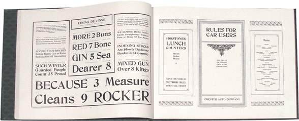
De Vinne was the most popular display face in the USA in 1900.


Barnhart Brothers & Spindler catalogue, 1915.

Thank you Nick! That is extremely helpful (and beautiful!)

P.S. love your typeface "Paradigm" -- has some of the most amazing small caps I have ever seen, and I love my small caps...

I agree that De Vinne was the height of fashion for display type circa 1900. There was a full range of variations from condensed to expanded.
I believe sign painters modeled some of their lettered signs on De Vinne. For a digital version http://www.myfonts.com/fonts/woodentypefonts/de-vinne/
Note that for many years the name De Vinne has been appropriated for a font that bears no resemblance to the circa 1900 De Vinne.
The 1900 era De Vinne is very similar to Hawthorn http://www.myfonts.com/fonts/linotype/hawthorn-lt/
Don

The years around 1900 were marked by the the popularity of display fonts that imitated hand lettering. These would have been copied by sign painters.
Perhaps one of the most successful was the style that became familiar with _The Saturday Evening Post_ name plate. This was produced as Post Old Style. This was a "rugged" font -- a style that today we see as distressed or grunge. Smoothed digital versions are available. Consider Saturday Morning Toast NF http://www.myfonts.com/fonts/nicksfonts/saturday-morning-toast/ and Lamp Post http://www.myfonts.com/fonts/jnlevine/lamp-post/
Don

BTW sign painters of the era avoided sans-serif like the plague, except for the most utilitarian or industrial usage.
As an alternative to serifs with prominent serifs they might use tiny serifs and add some decoration such as a shadow line. This ethos is captured in a modern font, Horndon

http://www.myfonts.com/fonts/linotype/horndon/
Don

Another modern font that would perhaps not seem out of place in 1900 is ITC Tiffany


http://www.myfonts.com/fonts/itc/tiffany/
Don

If still in doubt, you can use a version of the Trajan Roman capitals. Always fashionable. Used in signage in 1900.
Don

Thanks Don!
More invaluable information!
James

A search in the Fonts In Use Collection (admittedly still meager for this period) confirms Nick’s suggestion of De Vinne, and adds Bradley:

http://fontsinuse.com/search/advanced?artwork-date0=after-1895&artwork-d...

Bradley was cut by Herman Ihlenburg in 1895 based on lettering by Henry William Bradley for a Christmas cover of Harper's Bazaar magazine. Good quality digital by Ralph Unger http://www.myfonts.com/fonts/profonts/bradley/ http://www.linotype.com/653963/BradleyProRegular-product.html?SiteId=574
Modern usage:
Signage at Disney World. Magic Kingdom, Fantasyland (area signage), Snow White's Scary Adventure. Blizzard Beach (misc. signage). Disneyland Paris, Adventureland, La Cabane Des Robinson. Source: http://mickeyavenue.com/fonts/disney-fonts-list/
Label for Ketel One liquor.
Firestone tires.

Don

The fashionable Brothers would be appropriate, as straight-line, champfered/octagonal lettering was also a meme at that time.

(Although its present vogue might not suggest retro!)

The chamfer style of Brothers is also found in some other fonts that could work for signage Gin http://www.myfonts.com/fonts/fort-foundry/gin/ Bourbon http://www.myfonts.com/fonts/fort-foundry/bourbon/ Prohibition http://www.myfonts.com/fonts/fort-foundry/prohibition/
Don

Check this pre WW-I sign and compare the technique to Horndon http://typophile.com/files/tearooms.png
Don

Great!
Nick, I actually just had another post inquiring into opinions of how Brothers has become so "fashionable" yet has somehow avoided the backlash other popular typefaces seem to face... (Archer! ah hem...)

Captured from web.archive.org on 14 Apr 2015. view this capture