Typophile

Initials and numbers

geirrosset

Hello all

I am trying to design a classic looking book using initials for each chapter. Problem is that the chapters are facsimiles of old articles and cannot be changed. Some articles start with a number as the first character and some even start with quotation marks. All the good looking initial fonts I have seen so far do not include numbers or special characters, only upper case letters A-Z. Any ideas on how to design the page to work around this? Any good fonts to use as initials with a centaur font main text?

Best regards
Geir Rosset
Oslo
Norway

I assume you try to use some freefonts for the initials, because professional fonts have usually all necessary glyphs inside. So: Don’t use freefonts.

Don’t know which style you want to have with your initials, but Centaurea Outline could give a nice pairing with Centaur.

You might want to post an example of the font you're using, and as Renko suggested you might switch to a different font.

If the initial font you're using doesn't have numbers, a workaround might be to spell out the words — "Three" instead of "3".

In the case of a quotation mark starting the article, I'd probably use a regular quotation mark and then the next character would be large, as a large quote mark by itself would look weird. If your style is to make the initial caps flush left, do that and hang the small quote mark off to the left of the initial cap (probably raised above the baseline so it's near the top of the initial cap).

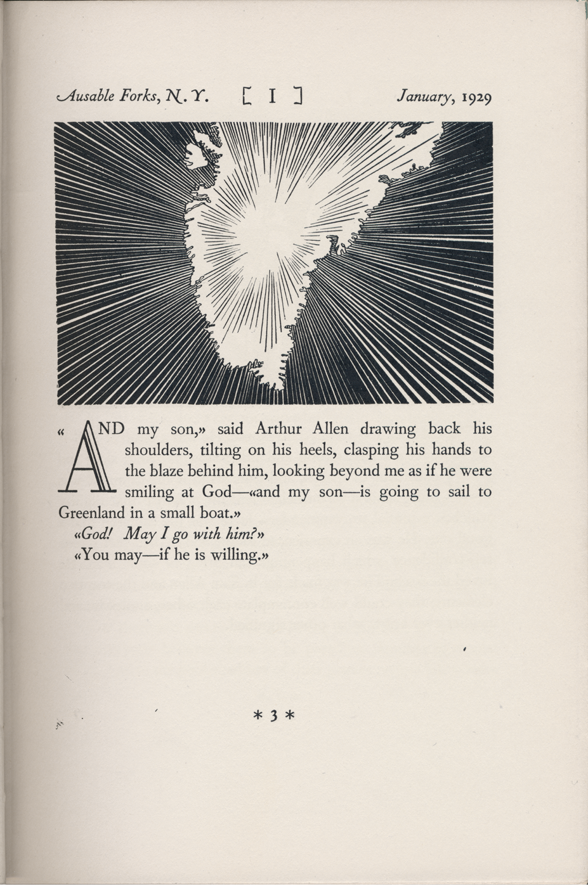
What James said. Quote mark treatment by Rockwell Kent:

Thank you

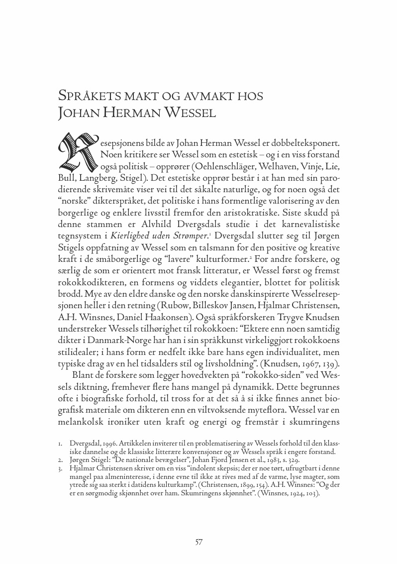
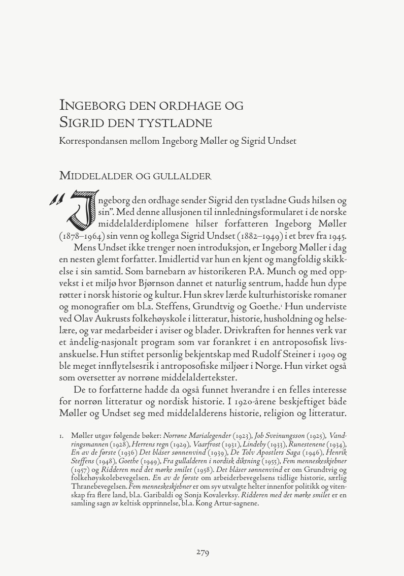
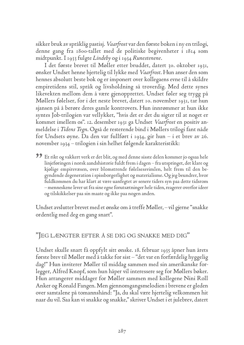
Centaurea Outline: This is an academic title and that font looks a bit too whimsical (not much but a bit). I have already used one that is a bit "stricter". Pages below (might be hard to judge when you can't read Norwegian).


Obvious ideas that spring to mind: Ashbury, Requiem, Hoefler Titling. None exactly matching what you've got there, though. I feel like something by Goudy might match, but I'm not too knowledgeable about his titling designs.

Obvious ideas that spring to mind: Ashbury, Requiem, Hoefler Titling. None exactly matching what you've got there, though. I feel like something by Goudy might match, but I'm not too knowledgeable about his titling designs.

What James said. Plenty of expert typographers and books on typography advocate the same.

Captured from web.archive.org on 17 Mar 2015. view this capture