Typophile

Looking for typeface to purchase for body text

Misbourne

Hi! I do some freelance teaching work in my spare time. I have a tax credit because of that and am thinking about buying a nice body text serif font for my own freelance teaching work (mostly lesson plans and powerpoint slides) that’s got more range than Garamond. (If this post feels familiar I posted it just before Christmas, but I think nobody noticed!)

I have a couple of criteria I’m looking for, in descending order of importance. No choice about foundry-in fact I’d be keen to support a small one doing something really good.

  1. Budget: ideally not more than $200 for the family. One-computer license, no web use envisaged.
  2. Old-style font would be my preference; something less hard than a Times. Should be very friendly and readable. I'd prefer something that looks genuine and authoritative without looking too mannered. I like Caslon, if that helps.
  3. Needs to plays nice with Word and apps that don’t understand everything about OpenType. Separate small caps fonts would be extremely helpful.
  4. Ideally reasonably tight linespacing.
  5. Optical caption/titling variants would be nice too.
  6. Bold style that’s clearly bold but not too thick. Needs to not stand out against quite small headings.
  7. Swash option would be nice, again ideally as a separate font or at least as a separate numbered stylistic set Word can use.
  8. Needs lining figures for maths.

Let's see if any of my text favorites pleases you... I really really love Lyon Text, you can get four styles for $200, say one of the two Regulars and Semibold with their respective italics. It is a beautiful face inspired by old-style (Granjon) but with a very friendly and contemporary appeal, with a lot of versatility IMO. It has lining figures, alternates and what not... The Text styles don't have swashes, but Lyon Display does have them.

Also, for just $239 you can get the whole 20 styles (!) of Freight Text, a fantastic workhorse text face, maybe not so close to the style you prefer, but one that I would never regret buying, especially at that price for the entire family.

In this thread, there's a list of some other awesome text faces you can browse and compare.

Hope that helped!

Mmm, apparently something went wrong with the links for Lyon and Freight there:

Lyon Text (Commercial Type): https://commercialtype.com/typefaces/lyon/lyon_text

Freight Text (Darden/GarageFonts): https://philsfonts.com/index.php/fonts/overview/GF060014X1

You’re welcome to consider Andron as well. It may fit your bill quite nicely:
1. $200 is fitting (we can make an off-site arrangement).
2. it’s Old Style, rather Venetian. A new design, no remake.
3. has a separate small caps font. SC Italic would be an additional option.
4. linespacing shall be OK (depends on your appl. settings).
5. Optical caption/titling variants exist, however, they are not (yet) released. – optional.
6. The Bold styles are clearly bold but not too thick.
7. A Swash option font (named Scriptive) is in the 6-font package.
8. lining figures are not in as a default. But I can make them default for you if you want.

Here are some samples how it looks like.

If you like Caslon, Williams Caslon is certainly a very refined take on the genre: http://www.fontbureau.com/fonts/WilliamsCaslonText/

Some people like Skolar: https://www.rosettatype.com/Skolar

hhp

Thanks for the recommendations-I thought I'd come back to this! I ended up narrowing it down to a shortlist which I will probably think about for a while.

Andron is very near the top of my shortlist, since having styles as separate fonts is very practical if I ever need small caps in Word. And the scriptive italic is lovely - just the kind of extra bonus I was looking for buying something new. My one reservation was its sizing - using the free version it seems a little small with wide lines than other typefaces set to about the same width, I imagine not a problem in a book but more difficult if you need to fit the absolute maximum amount of material clearly on one single page as I sometimes do. Williams Caslon has been high on my shortlist too ever since I read Berkson's own article on it, which as an outsider to type design I found fascinating. Lyon and Freight not so much - Freight just felt a bit too close to Times New Roman for comfort! I hemmed and hawed about Skolar, but those dagger serifs just didn't work for me.

I'm also considering Ashbury from Hoftype. It's a bit more modern than I was expecting I'd like, and clearly a bit of a display font with that x-height, but testing on paper with the free light weight everything about it feels really rather well-balanced. Some other Hoftype designs appeal to me, but that one most of all somehow. LTC Kennerley would be higher on my list - it's a lovely, rounded design that almost feels like Futura reincarnated as an old style serif with lots of near-perfect circles, and it has a small caps font - if it had an option to switch on a more restrained italic. I like swashes, but sometimes you just want to completely turn them off... Less likely, I also somehow like Vulpa a lot (maybe it's nostalgia - I read a lot of books in that kind of chunky serif growing up), though the bold looks a bit thick for me, and I'm also considering Fiesole because of its optical size set-a bit above what I was hoping to pay, but not an unfair price for the range of options. Any thoughts?

It doesn't have a separate small caps font, but I'm quite fond of Calluna. Of the options you're already considering, Andron is indeed very nice.

I'm also a fan of Vulpa (previously mentioned).

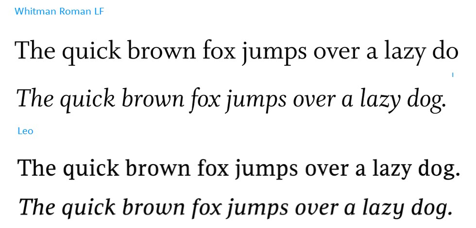
Two very different fonts:

Whitman
http://www.myfonts.com/fonts/fontbureau/whitman/
http://www.fontbureau.com/fonts/Whitman/

Leo
http://www.myfonts.com/fonts/canadatype/leo/


I also have Freight Text, and when I got it it was not style linked.

Captured from web.archive.org on 25 Feb 2015. view this capture