Typophile

Looking for sources on the geometric analysis of letters

This thread ran to 2 pages of replies and only one was recovered, so replies are missing.

LePierre

Hello everyone,

Pardon my amateurism.
I am looking for sources (books, articles, researchers,..) on the geometric analysis of letter shapes. All typography books and sites I have seen are concerned on type design aesthetically and historically, but do not address its geometric, non-artistic and non-aesthetic foundations:
- decomposition of letters in sub-shapes, structure of sub-shapes and comparison of letters' super-structures
- mathematical definitions of distance between shapes and letters, geometric definition of legibility
- analysis of 1D (no width) versus 2D (with width), geometric analysis of fonts
- geometric analysis and comparisons (and critiques) of fonts, of alphabets
- conceptualisation of new letters
- ....etc.

Does it even exist? Who in the world and history of typography has written about these fundamental topics?

Thank you,
Pierre

There is no such thing as “geometric, non-artistic and non-aesthetic foundations” of letters. Any geometry is applied post facto.
You can start looking on the works of Feliciano, Pacioli, and Dürer.

Hi Riccard0,

Thank you for your answers. I agree there always has been artistic choice in the definition of letters since the very beginnings, but I believe you understood what I was referring to: a viewpoint on letter design that puts this aspect away for a moment and concentrate on the geometry.
The works you mentioned are fascinating, and the majesty of roman capitals hasn't lost its grandeur. I wonder if something like this was made in modern times for lower cases, do you know?

After all, modern typesetting tools are extremely mathematical, as they define every typeface via vectorial settings of coordinates, bezier curves,..etc. - most of it being used only graphically, not mathematically.

I wonder if something like this was made in modern times for lower cases

The Romain du Roi.

Yes, Romain du Roi, beautiful work designed by 4 scientists under the order of the king Louis XIV, however is not yet what I am after. It defines a typeface, but I am after the common underlying structure that can define that an "h" is an "h" and not a "k", in any typeface. I am after the definition of the nature of "x" and "o". Just like in music the convention of note pitches evolved to what it is today, I am wondering if there has been modern (by which I probably mean 20th/21st century) attempts to define our unspoken conventions for Type.

Interesting question. Most times a computer displays a letter or prints it it is implementing a scheme to reduce the geometry of the bezier curves defining the outline to pixel positions - it is all very mathematical. Thankfully the designer only tweaks the vector handles and need not bother with the maths.

If what you are seeking is the simplest mathematical way to represent letters, analytic geometry can do that. For example a very thin san-serif I 10 units high is represented by x=0 , With y more than zero and less than 10. I tried typing more than with its symbol the tilted v, but the html thinks it is the end of the paragraph and deletes the rest! Representing a generic O is in the form x^2+(y-5)^2=26 (which adds an optical adjustment of half a unit!) where ^ represents "to the power". An x needs two lines one of which is x=y between zero and 10 for both x and y, and so on. Graphic plotters would use some such representations in the software programs. Hope I got all this right!

Hi Vladimir,

I agree the maths of computer displays must be very complex, taking colours, zones of pixels and pixels themselves all into account to refine, simplify or break the original bezier curves and shape contours. Thankfully I am not interested in this, but in the definition of the letter "templates", the mental geometric constructs that our brain create early on in our lives that make us recognise each letter.

Your second paragraph is a part of the answer: yes the simple template for an "I" is a vertical line, the template for an "O" or "o" is a vertical ellipse, and "x" and "X" are made of intersecting lines.
Those are the simplest letters, the simplest structures and if we calculate an average of those letters in every typeface, we can expect the deviation to be small. Some letters may have higher deviations, for instance the "a", "g", "z".. Those averages and deviations can be calculated, and from this work a convention can emerge.
I am looking for people and resources who worked on this.

Hi LePierre
You seek, or will become a Linnaeus of typography! He is the botanist who created a taxonomy of biology classifying species according to their attributes. One way to classify letters and glyphs is topological - how many counters do they have? I,r,s etc= zero.
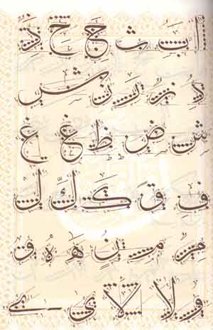
R,p,q etc= one. B,g= two. Or perhaps you are seeking to define a generic shape, the Platonic ideal for every letter? In my AlQuds font I did something like that for Arabic when I decided on the simplest most recognizable shape of a letter, given the many fancy calligraphic forms it could take. I did that instinctively and not in the systematic analytical way you may want for Latin.
http://vladimirtamari.com/alqudstry/index.html

Hi Vladimir,
Thank you for the comparison. Getting to a classification is not my objective, however could be an outcome of the ability to compare and measure in an objective way. From this ability, the ability to create an average, which might or not might be identical to a "platonic" ideal - this would be an interesting discussion: it might be the case that an average "g" isn't as pretty, simple, or recognisable as it could be, hence the ability to optimise templates. But one cannot form an ideal without being able to assess the present. Right now, every typographer has his/her own representation and judgements of types, and his/her own ideals, without an objective way to contrast and compare, as it typography was pure design/art, and not also a social communication tool which implies requiring a convention.
I cannot judge your AlQuds font as I am entirely ignorant of this, but the way you described makes me believe you understand my aim.

Hi Nick:
Thank you very much. I have ordered the book, and am reading about Panose and will probably contact its creator, Ben Bauermeister, to find out the recent evolutions. His work is a part of the solution, as it introduced measures of several font characteristics. I'd be curious to see what/if it has been used to measure individual letters, to see if his work has been ported in Fontlab modules...etc. I'll ask him.

Good luck. An interesting approach would be to overlay many transparent versions of the same glyph from different fonts in layers, perhaps in Illustrator or Photoshop. The darkest part of the resulting image would give an idea of the shape you seek.. Or not!
The same can be done mathematically by some algorithm, though I have no idea how.

An interesting approach would be to overlay many transparent versions of the same glyph from different fonts in layers

http://iotic.com/averia/

You might have better luck asking experts in Optical Character Recognition than experts in typography.

While I’m happy to help and discuss this topic, I disagree that geometric analysis addresses what is fundamental to typography.

People have been trying to reduce typography to scientific analysis and management since Dürer, but it seems to me that most geometry in glyph shapes stems from the peculiarities of different technologies—both those used to design, punch or draw the type, and those used to render typography.

Where the style is a script, the technology is a brush and paper, and the rendering is (hand-spaced) phototypositor, there is no geometry, and yet is this not type? Therefore, geometry is not fundamental.

In the first 25 years of digital type, prior to high-res Retina screens, the discipline of hinting, concerning alignment zones and stem widths, has encouraged neatness and regularity in type design—eminently measurable—but at the same time there has been a parallel track of grunge, deconstruction, distress and skeuomorphic imitation of rough, hand-rendered lettering of analog media. And this too is type!

Yes Riccard0 thats the idea. Playing with the concept lePierre suggested is fun but I rather agree with Nick. Fonts evolve and whatever is currently most used/liked is the acceptable shape of the letter. Cultural influences play a large part.. for example when Arabic numerals were introduced to Europe they were very close to the Arabic script in style. Since then they have evolved to match Latin letters serifs and all. Some misguided literary people in Beirut in the 1950s 'discovered' these Westernized numerals and adopted them as the original Arabic numerals! Now they are the norm sticking out like sore thumbs between the Arabic type, while the traditional Arabic numerals (Indic) languish for non-use. Similar outrages are now plaguing Arabic fonts whereby one of the Google web fonts all but unreadable is being adopted for its novelty. Glyphs change.

A mathematical approach to letter forms is, as Craig suggested, more of a cognitive science problem. See, for example
http://www.cogsci.indiana.edu/farg/mcgrawg/lspirit.html
which is a good example of being interesting as cognitive science but not as type design, because artificial intelligence is still at the point where the most rudimentary, stripped-down concepts of letter forms and letter styles are a difficult challenge. The complexities of what actual human type designers do have not really been theorized much yet.

@Vladimir: your remark on the evolution of numerals is fascinating, I would love to read about it.

@riccard0: the averia is interesting, eerie and familiar. Thank you.

@eliason: there is plenty of luck to have here already! But I concur that the recognition of letterforms impose to ability to compare, and the 'knowledge' of templates, so I should investigate. In addition to a geometric analysis, I would also like to see reflexions on the nature of letter forms, semio/socio/psycho-logic aspects, poetic too, something like what Bachelard did for elements (space, fire, dreams) http://en.wikipedia.org/wiki/Gaston_Bachelard and such a reflection, I think, should come from a combination of art and science. A conceptual foundation for typography that would feed into/explain the choices designers make daily in their choices: why egyptian slabs on the word 'God'? Why should the official printout of the european constitution have high ascenders?..etc.

@Nick: in what I have seen, most analysis of type is done of the "external" side of type. Let's define the "internal" side of type as the conceptual/abstract definition of letter forms, the "templates": e.g. an "o" is a circle, or vertical ellipse. The "external" aspect of type is about the surrounding aspects: counter size, ellipse direction, overhang dimension, natural/grunge aspects as you mention them,..etc. It's the internal aspects I'm interested about. I agree with you and the others that a geometric analysis of the external aspects doesn't lead far.

@DTY: very interesting, however I would ask an Artificial Intelligence team to go further: let's assume we have a group of A.I. beings, who are communicating orally with a basic language, then let's make them mute but let's give them the ability to draw.. what sort of shapes would they draw in order to communicate? In other words, what are the cognitive factors at play in the construction of a written language?

"definition of the letter "templates", the mental geometric constructs that our brain create early on in our lives that make us recognise each letter"

There are templates, but there is ZERO evidence that they are significantly geometric, and as Riccard0 says, all attempts to invoke pure geometric analysis have been failed post-hoc rationalizations.

Also, this discussion seems to be very western-centric. Note that there are plenty of writing systems (e.g. Chinese and Japanese) where this geometric fixation would be simply laughable, nobody could take it seriously, but there are also likely other writing systems where it would actually apply.

T

@ Thomas: "Note that there are plenty of writing systems (e.g. Chinese and Japanese) where this geometric fixation would be simply laughable, nobody could take it seriously, but there are also likely other writing systems where it would actually apply."

Yes - add Arabic to the scripts where it would be difficult to impose a geometric straight jacket to define *the* ideal shape of a given letter. Various scripts do have their rules - for example the height of the aleph in thuluth script is defined by so many dots aligned beside it (picture) but this applies only to that script. In my AlQuds sans serif I instinctively tried to find the ideal generic shape for each letter, distilled from the most commonly used traditional scripts, but no geometrical template was used.
Vladimir

Geometrization has always been an afterthought for me: when designing logotypes I often find that they frequently fall under some geometric proportion all by themselves.

It takes a couple of years of visual training but now I value those abstract geometric exercises I had to repeat forever in design school... jeje

@Thomas: By template, I mean a visual template, a sort of abstract 2D wireframe, or a cloud made of the series of acceptable/recognisable shapes for a letter, so by 'template' I mean a geometric one so I'm not sure what you understood by templates not being geometric. And it's not necessarily about defining things with exact precision, but saying: a lowercase "c" is basically a left-side ellipse, has _those_ relations between the "i" and the "o", has _these_ characteristics compared to a "g".. and why does it need a terminal and/or a finial instead of being clear-cut at its center? For reasons of history or legibility? Is the "c" the easiest letter to write by hand, as it looks like it's part of a group of letters that don't need much ink/pixels? (hence: definition of letter "mass": does this exist?).. Amusing fact: the first word of the bible in yiddish is "Bereishit": בְּרֵאשִׁית which starts with a בְּ because, from what someone told me, it has an opening shape, like a uppercase "C"..
As you can imagine, those questions or reflections are not related to particular (western) types, but to the abstract form of a letter, I'm just wandering who has written what about this kind of things.
And I agree it's completely western-centric, as I have no familiarity with other alphabets. One does with what one has.
But whatever the origin, an alphabet implies the ability to recognise a letter, visually (= geometrically), so the concept would still apply.

@Vladimir: thank you again, and it's a beautiful image that you've added. If you have sources for ignorant westerners to understand arabic scripts/alphabets, I'd be happy to look at them.

@rs_donsata: I have a book, "the Art of Hand Lettering" by Helm Wotzkow, published in 1952, which is very humbling: imagine having to do draw by hand, and by hand only, perpetrating those school exercises every day in your professional life..

visually (= geometrically)

That's an assumption you would need to prove.
To me, visually ≠ geometrically.

riccard0: I feel it's a matter of definitions: I mean 'geometric' as anything visual that can be defined through geometric forms, requiring clear colour contrasts and shape definition.
Following this, this is not very geometric:

In comparison, all alphabets are very geometric.
Maybe you thought of one of the more reduced views of the word, geometry as opposed to the emotional characters of a sign, as in the sense of a 'geometric font' like Futura, geometric in the sense of cold and symmetric.
Again my point of view is basic, abstract. All alphabets are made of sign, each written sign needs to be both clearly different from other signs ('u' is not 'v') and clearly identifiable as an instance of an abstract sign ('u' is a 'u' and not just a curve). There are tensions of different amplitudes, symmetries, exclusions,..etc between shapes that exist beyond the particulars of a type design...

This is a cognitive issue. You need to dig into perception, pattern recognition, and even language development. Typography is at it's root a system of marks that are symbols, and the "apprehensibility" of those marks, from a "mark qua letterform" perspective is largely a function of their relationship to other marks of similar form or style, with your brain doing the required processing to "decode" them into language. That's why a single "g" from a highly stylized font might look like nothing (and not adhere to any usual or customary definition) but be recognizable as a "g" in the context of words so similarly styled.

It's related in a way to why you can read this:

The phaonmneal pweor of the hmuan mnid, aoccdrnig to a rscheearch at Cmabrigde Uinervtisy, it deosn't mttaer in waht oredr the ltteers in a wrod are, the olny iprmoatnt tihng is taht the frist and lsat ltteer be in the rghit pclae.

Digital technology reduces all typefaces to geometric artefacts.
Here are three solutions of how to convert digital text into typography, each of which required, and constitutes, a “geometric analysis of letters”.

PostScript Type 1
This elucidated many geometric qualities of letters, in particular in the way that the invention of hinting—using nominal stem widths and alignment zones to control shape—was required to address the problem of coarse pixel screens. https://partners.adobe.com/public/developer/en/font/T1_SPEC.PDF

Metafont
Lines and splines.
http://en.wikipedia.org/wiki/Metafont

Bitmap
A simpler approach to geometrizing the alphabet.
https://www.fontfont.com/fonts/call

I have also heard that the Bentons developed algorithms for optically scaling typefaces, at ATF in the early 20th century.

@Nick- Digital technology reduces all typefaces to geometric artifacts.
Not necessarily. Reading that, an image of ancient Egyptian hieroglyphs came to mind and in fact someone has made such a font
http://www.dafont.com/ancient-egyptian-hieroglyphs.font

Also many modern 'fonts' made of pictures of one sort or another that are now made possible by our clever computers and software. One day the word 'run' may be displayed by a little logo of a running figure!

Vladimir, all digital images are geometric, their fundamental essence being mathematical.

Therefore, any method of digitally rendering typographic shapes requires a geometric analysis of alphabetic properties.

@Nick - Yes in essence you are right, but the examples you gave are essentially linear - I was wondering about how letters might evolve into other visual formats now that technology allows it. Colored animated 3D typography with sound effects anyone?

@LePierre - Nice to see that glorious Van Gogh in the staid pages of Typophile. Reading up in Wikipedia on Arabic numerals I see I have misrepresented their evolution. Yes typographically the numerals in Latin fonts today needed to be redesigned to match Arabic fonts, but historically I see that it was in the West that the numerals have retained their essential forms over a millinium, while they evolved to match the Arabic script in the Arab/Islamic world!

@Suijin: There are cognitive aspects to what I am looking for, and a reflection on letter shapes alone needs a complement of psychological studies (as you mentioned: pattern recognition, language development) if we were to make a proposition to alter our alphabet or language structure. Look at the example you gave: a study showing our capacity to understand words in which the orders of letters is randomised: it's an interesting study, but doesn't it feel that we're only at the beginning of something? Taking my personal interest and point of view: are there psychological studies on our capacity of recognition of specific abstract shapes, e.g. do we better recognise a series of circles, points, or segments? What are the pros and cons or using a stylised 'g' (a complex form) versus a simple one? Do we better recognise the 'g' (which I think is the most complex letter - geometrically speaking) or a 'o' or 'i'?
Many aspects, related but distinct from typography as we usually see it.

@Nick: thank you again for those references. Being a software engineer myself, I'll read them a bit more, however they all are concerned with the exercise of rendering letters digitally, which I don't find very fascinating. Solutions based on restricted technology get always quickly outdated. I wonder for instance how the latest screen technologies (e.g. Apple Retina) changed the techniques of hinting or antialiasing, but it's not very exciting.

@Vladimir: yesssss for colored animated 3d types, and at first, dynamic intelligent ligatures, smart poly-angular italics, poly-size bold, colors that detect and adapt to background. I want to type "Here beginneth the story of..." and I want my text editor to draw me something like:

But we're digressing..
Were you looking at http://en.wikipedia.org/wiki/Arabic_numerals?
I find http://en.wikipedia.org/wiki/Bakhshali_manuscript particularly beautiful and inspiring:

Now they are the norm sticking out like sore thumbs between the Arabic type, while the traditional Arabic numerals (Indic) languish for non-use.

I am of course puzzled by this. Shouldn't anything that helps to improve international communications be hailed as progress? A greater uniformity in mathematical notation between different societies will do that.

…are there psychological studies on our capacity of recognition of specific abstract shapes, e.g. do we better recognise a series of circles, points, or segments?

It’s known as Readability.

@LePierre - you are the software engineer - create an AI font designer to do your (or its) bidding :)
@ quadiblock - good point indeed I think one of the main reasons the 'Latin' Arabic numerals took hold in Arabic texts is that it conforms with international telephone, banking and accounting practices. The objection to using these forms entirely unchanged - ie without being redesigned typographically to adapt to the style weight, serif or sans etc., of the Arabic or Hindu or whatever font it is used in- still stands.

@Nick: Readability is the ease with which a written text can be understood by a reader. It refers to entire words, sentences, and paragraphs, and encompass a wide variety of factors such as the text content, the language,..etc. Legibility is closer to may aim, as it is the degree to which individual characters in text are understandable or recognisable based on appearance. Readability is influenced, among other factors, by font choice, point size, kerning, tracking, line length, leading, and justification. However, I would be interested in a degree below entire letters: I want to know the brain reaction to basic geometric elements: circle, vertical segment, horizontal,..etc. I want to tie this analysis to a semantic analysis: history of signs/shapes, psychology, sociology,..etc. I want the beginning of an awareness of a vision of what an "|" provokes, how well it is recognised, and why "–" should or should not be used and why. I want to say "the letter A should be drawn like ∆ because.. and ∫ should replace s because...

@Vladimir: I'm not looking to create a font, or a software to create fonts, but a I'd like a tool that lets me do geometric calculations I need, I'm just not sure what to use... I could try FontLab and develop my extensions in Python, but there might be tools better suited for this. Do you know? I could perhaps use FontLab to extract path points, or even calculate wireframes out of existing fonts, but I'm not sure.

Colored animated 3D typography with sound effects anyone?

In one episode of Star Trek: The Next Generation, an alien language is displayed on an interactive screen as images of rotating balls with colored patterns on them.

The objection to using these forms entirely unchanged - ie without being redesigned typographically to adapt to the style weight, serif or sans etc., of the Arabic or Hindu or whatever font it is used in- still stands.

One certainly could borrow the numerals from any number of Latin typefaces designed to simulate Arabic or Chinese, or even just from a calligraphic typeface.

I can think, though, of a number of reasons this option was rejected.

Since Arabic does have its own set of digits, it may have been thought that the foreign ones should stand out, so that people don't get too comfortble with them. And an attempt to stylistically Orientalize the Western digits could well have been perceived as patronizing and so on. Or, in a more pragmatic vein, since those weren't the forms people were taught from childhood to recognize, if they don't stand out as alien, they have the potential to cause confusion and slow reading.

When English texts include words in Greek, Hebrew, Chinese, or some other language with a different script, ordinary typefaces for those scripts are used - often, the equivalent of Century Expanded for the Latin script: the plainest and most standard typeface one can find.

In the hot metal era, that would simply be all that the printer would have on hand. (For Greek, there is a particular convention, known as Porson Greek, with its own history.)

There is no temptation to handle those scripts with a hyper-Latinized typeface so that they will "fit in" visually with the surrounding text.

If a paragraph suddenly contained, say, a word or phrase in heavily Latinized Gujarati... say (and the Gujarati script happens to lend itself to such treatment, with relatively simple forms and no Devanagari overbar - and I've seen it done too for display typography in that language)... unless context were to indicate the language likely to be used, the reader would likely be utterly perplexed as to what language these strange symbols might belong.

Come to think of it, this is an indictment of the "unified" sans-serif typefaces currently being designed for mobile devices, which are the subject of another recent thread: they may be great for their intended purpose in user interfaces, but they are probably not recommended for (the kind of) scholarly publication (that includes interspersed quotes from different languages).

I don’t think that the shape of individual glyphs is particularly important, we are very adept at decoding symbols. What is important in type design is how the glyphs combine.

You could, for comparison, combine all the tastiest ingredients, but end up cooking something completely unpalatable.

@quadibloc - An alien language
Here is a dictionary page for an alien language I invented!
http://vladimirtamari.com/europan-english-dictionary.pdf
I used glyphs based on a 'font' made up of illustrations of quantum states used in my physics theory.
http://vladimirtamari.com/beautiful_universe_font.html

I will have to re-read your argument about numerals - am a bit rushed today.- but as Nick says it is important how glyphs combine - harmoniously.

BTW quadibloc the whole thrust of your original question suggests some relation to OCR? How a computer interprets a scanned glyph it senses into a 'letter'. Right?

I wasn't thinking of OCR at all, but instead of people reading texts; if they see a quote from a foreign script, they can identify the script by the way it looks - unless it's harmonized with their own. And this same principle would apply to numerals.

Its a question of balance between opposite requirements - each script has its own historical development and inner logic and that should be respected. Arabic should not look like Thai or Chinese. On the other hand there is a process that I call 'sans serification' that is involved in adapting these scripts to modern life. In that respect technical, aesthetic factors and those of readability and legibility all point to simplification and harmony in the glyphs.

@Nick: you may not think glyphs matter, I believe they do. I believe recognising a glyph, any glyph, into a letter, is only the tip of an iceberg. I'd like at least to convince you that each glyph has a poetic substance, is a fantastic source for childhood imagination, a monument to be celebrate. It shouldn't be hard, for a visual audience such as yours. So here are some random thoughts: Haven't you ever felt that the uppercase P or F were in danger of falling? Do you sense the majesty of the A, Eiffel tower, star of the alphabet. The B is so fat it's not even funny. One can't spell slim, thin, and lean with it. Glyphs have friends: p,q,d,b make a gang, x and o conspire in secret. Who will write the eternal beauty of an H, ladder to Heaven? Who will say there's simply something wrong and awkward with k, r and Q?
More seriously, is our alphabet geometrically sound? In the sense of: is there a geometric balance between all letters or are some letters very different from each other while some are very (too) similar to each other? I am surprised by the purity of x and o and their opposition, and I wonder if the resemblance of m and n and u may be a (hidden, taboo) legibility issue. What shapes does our alphabet ignore? The tree letters c, u, n have open counters going right, up, down, but why not (suspending our anthropocentric judgement) a letter with a left one, like a b without a stem?
(I'm not trying to be clear - just throwing a few thoughts to express why I care about those abstract shapes.)

@Vladimir: beautiful electronic spin font! Trying to read your paper...

@LePierre - your glyphs matter paragraph should be expanded into a book for children!

I'm with LePierre. That's not to say that the way the glyphs combine and relate to each other is not *also* important, but Nick's view that individual glyph shapes are irrelevant would contradict most of what cognitive psychology has learned about reading.

…Nick's view that individual glyph shapes are irrelevant…

I DIDN’T SAY THAT!!!!!

This is what I said:
“I don’t think that the shape of individual glyphs is particularly important, we are very adept at decoding symbols. What is important in type design is how the glyphs combine.”

The way it is, it doesn’t matter WTF individual glyphs look like (as long as they bear a passing resemblance to the alphabet and are fairly consistent), the horizontal metrics can make “good” glyphs work poorly, or “bad” glyphs work well. I’m surprised that, as a type designer, you didn’t know that :-)

@Nick: The "how the glyphs combine" part is always affected by the shape of individual glyphs, e.g. there is no way to combine a "I" (uppercase i) with a "l" (lowercase L) intelligently without altering the shape of each glyph (picking a font with the right serifs, width,..etc) and this is due to the alphabetic mistake of having two identical abstract shapes. As a graphic designer making a poster, you'll amend your font choice, as a type designer, you'll work on I and l, and in my particular goal - as a.. glyph analyst - you'll think hard about why two completely different sounds should be represented with the same shape, why it has been this way, what it means, where the little dot on the i (so cute) comes form and why is it lost in uppercase and why not keeping it, and couldn't we keep the lower stem "_" of "L" in the lowercase form...etc. I totally concur my goal has less immediate application that traditional typography, just like every other analytics exercise, it's about observing something that looks unessential, and trying new things, like tasting sea salt, or rock salt, or pickling salt, and making dishes with each (http://www.realsimple.com/food-recipes/cooking-tips-techniques/cooking/s...).

This paper takes a very mathematical look at character complexity and redundancy through geometry. I cited it in my own paper on Glagolitic.

CHANGIZI, Mark - SHIMOJO, Shinsuke. Character Complexity and Redundancy in Writing Systems over Human History. In
Proceedings: Biological Sciences, Vol. 272, No. 1560, s. 267-275. ISSN 1471-2954 pdf

LePierre, it doesn’t matter that I and l are the same character shape, context will usually disambiguate them.

They were different shapes prior to typography, but ironically, from your perspective, type design has brought them closer together, because of both the recognition of textual context for providing meaning, and typography’s ability to nuance the basic shapes with details that relate to how the bicameral (upper and lower case) system has evolved, namely stem thickness, relative height, and serif treatment.

So the identicality of I and l is not a bug, but a feature that contributes to the overall readability of typography—although not of course individual glyph legibility.

I would argue that, assessing the pros and cons of the simple vertical line as a glyph shape for two separate characters, the economy and simplicity of this shape is so powerful that the efficiency (both in execution and recognition) obtained by using it outweighs the drawbacks. This is what design is, a compromise (or transcendent raprochement) between competing criteria, in this instance legibility and readability.

The same principal has allowed us to identicalize the character forms of O, o, zero, degree and ring, distinguishing them with subtle, typographically meaningful transformations of the basic round shape, without resorting to making any of them heart-shaped.

I love Janacek's music but this is the first time that I realised his Glagolitic Mass refers to an alphabet!
http://vladimirtamari.com/paintmusic9.html

Perhaps it refers to the period in the history of Russia (or perhaps Bulgaria? - oops; actually, Croatia, Romania, and Moravia are the chief other possibilities) when that alphabet was used, rather than the alphabet as such.

Ah: a Czech origin for the Glagolitic alphabet explains why Leoš Janáček would have considered a Glagolitic Mass in line with his pan-Slavic views, and he was thinking of the alphabet.

I'm sorry, you didn't say irrelevant, you said: “I don’t think that the shape of individual glyphs is particularly important, we are very adept at decoding symbols. What is important in type design is how the glyphs combine.”

I could not disagree more strongly, and I would say the research significantly contradicts the first half of your statement.

As for the second part, although it is *also* important how the glyphs combine, to the extent that the relative contributions to legibility have been specifically studied, it appears to be quite a lot less important than the individual glyph shapes. If you're talking relative importance, you have it backwards.

Sorry I don't remember the specific study right now. It's the last one mentioned in the relevant chapter of Sofie Beier's book on legibility. I think it was 2011, an Italian sounding name starting with an R perhaps. But I just loaned out my copy of the book last night. :(

I should also say that any discussion of the relevant contributions and importance of two variables is dependent on the population variability of each variable. So for example, if you create a font by taking glyphs from a totally random or unrelated set of fonts, you'll suddenly "discover" that how the glyphs combine makes a huge difference. But within the norms of type design, according to the one study on the topic, it was more like 3:1 for individual glyphs over any higher-level effects.

I think you have misinterpreted what I meant by “combine”; perhaps I should have said “are configured to form a coherent system”.

I attempted to explain this with the example of the straight line (I, l and 1, and for that matter hyphen, dashes, macron and underscore) and circle/oval (O, o, zero, degree and ring).

As individual symbols, the circles are identical, and easy to categorize and identify as such. That is legibility. But which character does this shape, once discerned, signify? For the type designer, the circularity is a given, and the important task, for disambiguation, is both to make sure they are not confused, and also to harmonize their treatment stylistically.

In a typeface comprised entirely out of straight lines, these nominally circular or oval characters become quadrilateral, yet this conceit is taken in stride by the reader. Again, it is the type designer’s task to make sure that a particular shape is recognized as a specific character, and this is done by typographic means, in relation to the typeface as a whole.

Well, if you want to say that the shapes of the other glyphs in a font affect one's ability to decode a glyph, of course I agree. The reason that a nearly-closed "C" shape is a problem is that it generally looks like an "O."

Another consideration is that the norms matter, as well as the actual other shapes in the font. You can make a U that looks a lot like a V, and even if the actual V in that particular font is different and distinctive, it is still a legibility issue.

Didn’t you contradict your theory by putting alternate forms of /a and /g in Hypatia?

If they both work, doesn’t that mean that the shape of the glyph is not particularly important, as long as it conforms to some kind of familiar or recognizable precedent?

That would seem to be how the single-bowl /g found its way into the sans genre, coming from the cursive italic.

Captured from web.archive.org on 22 Mar 2015. view this capture