I'm looking for the font from the 1930's Norman Rockwell era Saturday Evening Post which was used in their masthead. Anyone have a name or know where I can find it?
I'm looking for the font from the 1930's Norman Rockwell era Saturday Evening Post which was used in their masthead. Anyone have a name or know where I can find it?

Custom by Guernsey Moore. There's a digital font in the same style called Saturday Morning Toast (Nick Curtis, 2001).
If you are talking about the two-line nameplate that ran the full width of the cover, it was most likely hand-drawn—not a typeface. That particular nameplate actually dates from the very early 1900s and was used for decades.
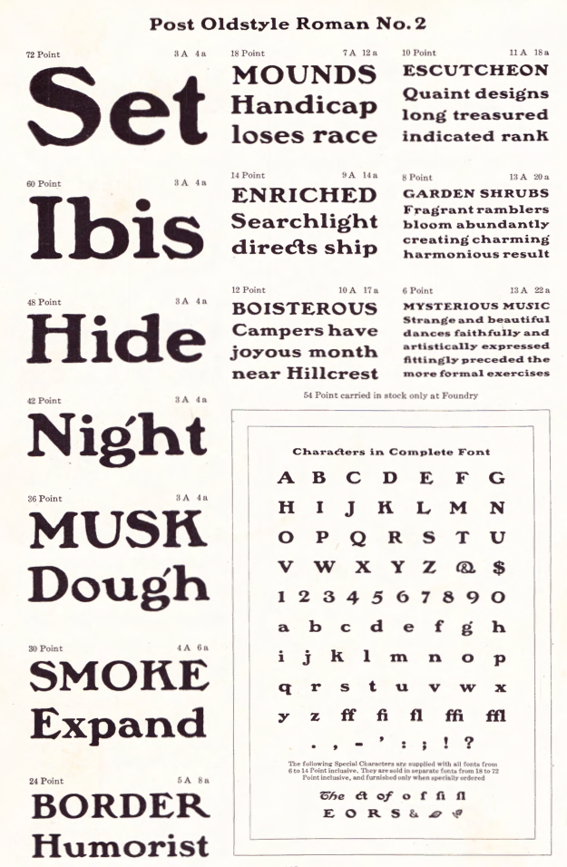
American Type Founders did release a typeface called Curtis Post in 1902. It was based on Post Oldstyle Roman No. 2, which was the model for hand-lettered headings in the magazine at the time:
http://luc.devroye.org/fonts-71374.html
http://luc.devroye.org/EJKitson-or-GuernseyMoore-or-HermannIhlenburg--Po...
There are a few digital “tribute” typefaces:
https://www.myfonts.com/fonts/nicksfonts/saturday-morning-toast/
https://www.myfonts.com/fonts/jnlevine/lamp-post/
Another typeface from that era that is very similar is Windsor:
http://www.myfonts.com/fonts/mti/windsor-mt/

I'm not a fan of the "rugged" style of lettering used in the masthead -- but if you are a fan of distressed and antique lettering styles, your mileage will differ.
I prefer the polished version made by Nick Curtis.
For searchers of authentic versions of the letterhead the I concur in the posted information on Curtis Post of 1902 and Post Oldstyle Roman No. 2.
Every major foundry of circa 1900 produced similar "rugged" rounded letter fonts of similar weight. If there is any interest I will post a list.
Don.
Thanks, Don, I’d be interested in that list.
OK Kevin, I will do a round-up of the usual suspects.
Don
First is Buffalo, a popular typeface in the early 20th century by the H.C.Hansen foundry:
Virtually identical typeface sold in Europe as Kolonial. No digital.
Don
Second is Blanchard Inland -- a font from Inland Type foundry circa 1900. digitized by Paulo W http://www.dafont.com/blanchard-inland.font?text=Saturday+Evening+Post
Don
Third is Wood Stevens Bold -- a font digitized by Paulo W http://www.dafont.com/wood-stevens-bold.font?text=Saturday+Evening+Post&...
Don
Tom Carnase and Ronne Bonder used Post Oldstyle as the basis for ITC Gorilla. http://www.myfonts.com/fonts/bitstream/itc-gorilla/
Don
Updated:
ATF's Hearst, digitized by Nick Curtis as Ragged Write NF  http://www.myfonts.com/fonts/nicksfonts/ragged-write-nf/
Also digitized by Richard Kegler as P22 Kane  https://www.myfonts.com/fonts/p22/kane/
Don
F.W. Goudy's Powell of 1903 GoudyPowell1903@85pct_5994.jpg"> Produced by the Keystone Foundry as a commission for a Mr. Powell, who was working at the time as advertising manager for the Mandel Brothers. Powell had previously commissioned a font for another company. That font became Pabst Old Style, as shown in the ATF 1906 catalog. A digital version
 http://www.myfonts.com/fonts/lanston/ltc-pabst-oldstyle/
Don
Inland produced a condensed version of Pabst Oldstyle, which appeared, with the name Avil, in the 1912 ATF catalog.
Don
Updated:
Barnhardt Brothers and Spindler had Plymouth in their 1907 catalog  by Rick Mueller in 1999
http://www.fontspace.com/rick-mueller/plymouth
BB&S also had a condensed version 
Don
Captured from web.archive.org on 21 Sep 2019. view this capture