
Hi everybody,
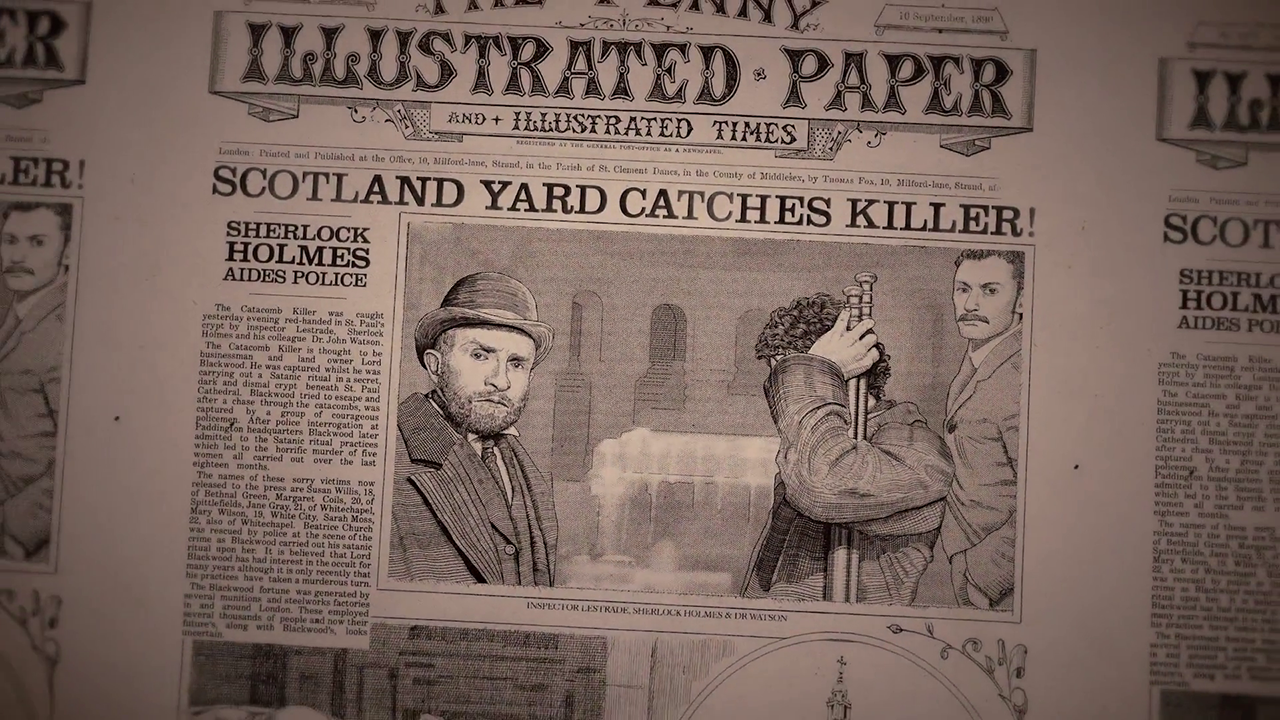
Does anyone know the name of the different typefaces used on this "Sherlock Holmes" movie still ?
Thank you for all the help you can provide !
Tristan
P.S. : The picture is big but one of the font is very small
Hi everybody,
Does anyone know the name of the different typefaces used on this "Sherlock Holmes" movie still ?
Thank you for all the help you can provide !
Tristan
P.S. : The picture is big but one of the font is very small


YARD CATCHES KILL: Clarendon:
http://www.myfonts.com/search/Clarendon/fonts/

Edited:
The nameplate of prop newspaper in the Sherlock Holmes move is an authentic reproduction of the engraved nameplate of a British newspaper called _The Penny Illustrated Paper and Illustrated News_. Compare to a letterhead from Nov. 5. 1881

Show is pretty close. Really thought with such a recent sample we could have been able to find a match... Anyway, reminds me of Trefoil Capitals.
Another interesting one for baseline "AND ILLUSTRATED TIMES" is Tuscalooza.
Edited:
The second line of the nameplate is a simplified version of first line. Compare to the rather emaciated Gladiate

Also Primitive-Tuscan http://www.myfonts.com/fonts/jnlevine/primitive-tuscan/
Don
You can read some issues of _The Penny Illustrated Paper and Illustrated News_ at Villanova http://digital.library.villanova.edu/Item/vudl:337174
Don
The _L_ of Herr Foch has a terminal treatment close to the _L_ in the nameplate.
Unfortunately IntellectaDesign does not provide information on the provenance of their fonts, which in the case of Herr Foch and most others, are autotraced from old specimens. Note the rough outlines

Thank you for this one. Did anyone know the name of the font used for the rest of the article ?
Too small a sample to ID, but could be Times....
Is the sample big enough of this picture ?

Well, it’s not Times, but still too small a sample to definitively ID (individual letters need to be about 100 px tall).
Some form of Century or Scotch Roman…
Captured from web.archive.org on 15 Feb 2015. view this capture
Headline is a lighter weight of Clarendon http://www.identifont.com/show?2SA than the one in your previous request http://typophile.com/node/122198
Don