
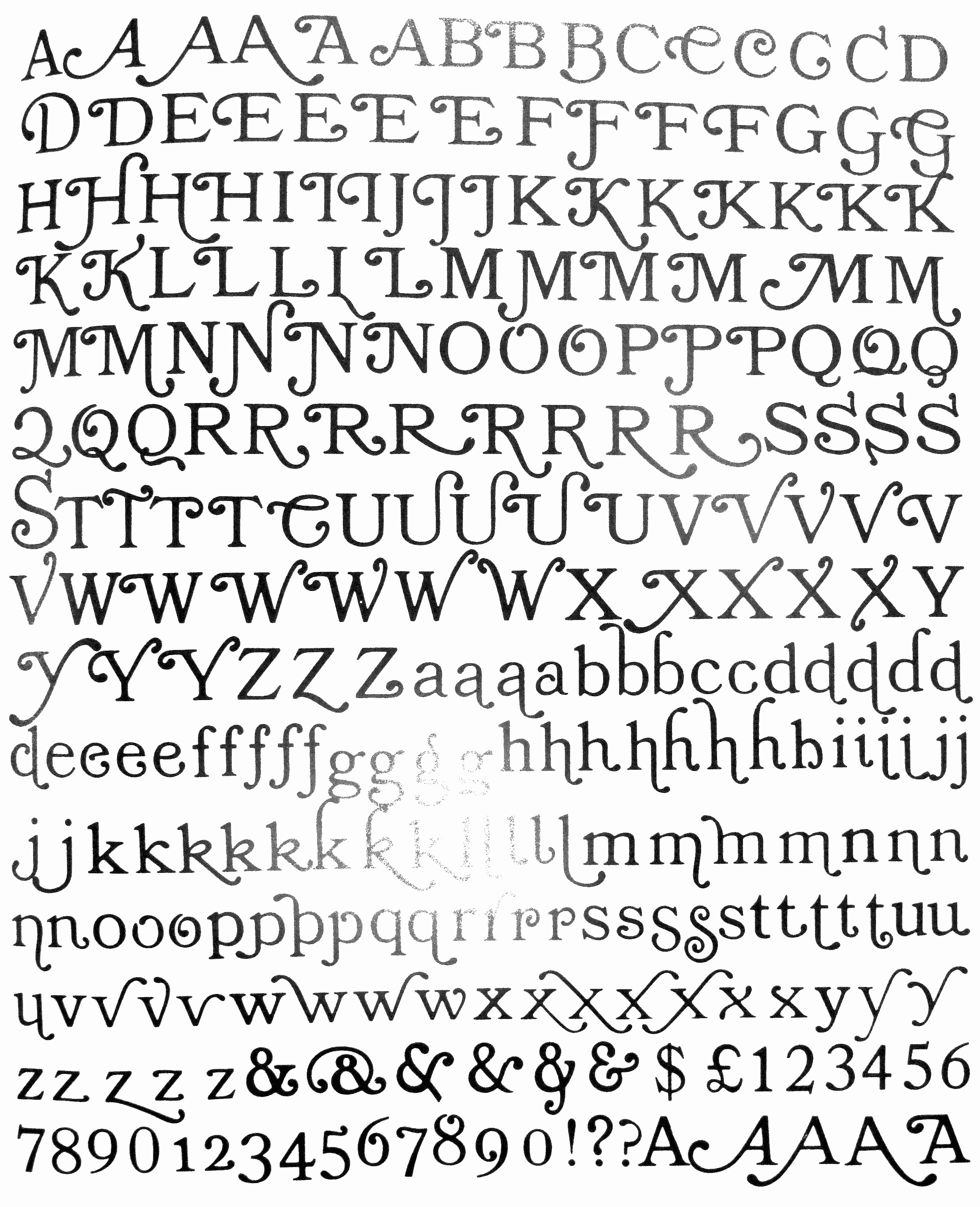
I am curious if there is any information regarding this font? I tried google but doesn't seems to return any relevant results...
Curious if there are any specimens or scans available?...
I am curious if there is any information regarding this font? I tried google but doesn't seems to return any relevant results...
Curious if there are any specimens or scans available?...


No image.
That's exactly what jch02140 is looking for: an image of Times Roman Swash.
Point taken. Unfortunately, I don't recall seeing this. Photo-lettering era?
Don
Photo-lettering era?
Almost certainly: the era when no typeface was safe from swash treatment! ;-)
Case in point, Times Bold Modified № 2: http://www.flickr.com/photos/stewf/8548006644/
Or Times Modern Swash, which isn’t Times, but Trooper: http://www.flickr.com/photos/hardwig/8578817079/
(links taken from the comments posted here: http://fontsinuse.com/uses/3368/the-other-times-modern)
OMG, now I remember these horrors! :)
If someone absolutely has to use the effect, I suggest moderation. Perhaps as an initial enlarged letter at the start of the first paragraph in a text.
Don
Times Extra Bold Swash might work but please don't go all Meola Bookman on it. That would utterly destroy a useful font.
Thanks for all the info.
@George Thomas When you mentioned Meola Bookman, I actually google it and I got a hit from Luc's site
http://luc.devroye.org/Affolter-1981Catalog-MeolaBookmanSwash.gif
...That's a pretty excessive swash variants...and some of them don't actually look any better... O_o

In the case of Meola Bookman, my opinion is that it took an unattractive text face, and actually gave it a useful reason for existing as a fancy display face.
Giving Times Roman the same treatment wouldn't "destroy" the typeface, because people would still be free to ignore the modifications, and use the original. If one wants a decorative face with lots of swashes, and there are places where such a thing could be used tastefully, why not start from a good typeface as a basis?

Alphabet Innovations (Phil Martin's company) did a version of Time Bold with swashes around 1970 and called it Endowed Jones. Not particularly well done, in my opinion.


I wonder how they can present it with a straight face, name and all…
Tongue-in-cheek was always part of the AI brand.

If one wants a decorative face with lots of swashes, and there are places where such a thing could be used tastefully, why not start from a good typeface as a basis?
My feeling is that it's more about the name and reputation of the typeface than it is about the design.
"This typeface is very popular, but not very decorative. Why not add swashes?"
Making a new typeface or adding swashes to a lesser known typeface requires more work in marketing. I don't think anyone is adding swashes to any typeface to improve the design, but rather to ride on the success of its name. Why else would Helvetica Flair exist? Certainly not because it's exactly what we were looking for or because it has so much potential.
I would have called it Endowed Iones - that particular swash J variant, as far as I'm concerned, is closer to a swash I - and not very good at that either. However, I don't have objections to the rest of the font.
OK, the swash G, the swash Q, and the second swash L (for the same reason as the J) are not that great either. But after eliminating or replacing these four lousy glyphs, it wouldn't be too bad.
I agree it's not awful, but definitely not great. But my point is that my expectations for the outcome for these practices are very low. I don't consider it to be a good practice to attach swashes to typefaces that weren't intended to have swashes. If this typeface was intended to have swashes, I think it would have been planned for the swashes better.
But also, I think the swashes itself in this case are often just not well designed. I find the swash on /y to be horrible, and I would love to modify the swashes in /a and /e as well. I feel the swashes are very much an afterthought, rather than part of the design of the typeface.
The fact remains, whatever its merits or flaws, Endowed Jones never gained traction with graphic designers. I don't think I ever saw in actual use. It was an attempt to exploit the popularity of Bookman Swash. In that it was not unique.* But it flopped in the marketplace, never made it to digital, and only old type geeks like me have even heard of it.
*You might find this old Typophile discussion of interest: http://www.typophile.com/node/2833 Unfortunately, most of the image links are broken. Or fortunately, depending on your point of view.
Also: I think the swashes in Endowed Jones look like stretched-out chewing gum. Ugh.
Sort of looks like an infestation of lizard tongues. But they didn't catch many flies :)
Perhaps the treatment might not look as clunky on an Italic? But even then, I have my doubts....
Don
Don't tell me they made a flare font for courier.
Mark, do you happen to still have this picture of a flared courier you presented in the other thread? I could use a laugh.
Naturally...

That is something…
Couldn't this idea actually lead to something though? I don't immediately see how a monospace typeface with swashes would work, but in theory I suppose the awkward spacing in monospace typefaces could be compensated for with swashes.
A direct descendant of the TR Swash idea

I think most of the letters are just too stiff for swashes. It's just odd.
I tend to agree with your observation that "most of the letters are just too stiff for swashes." If there was some flex in the main strokes then the applied loops and swirls would perhaps be less artificial.
Don
Here's another one I just found (hat tip to Grant Hutchinson for reminding me about it), Moore Swash, designed by David Moore in about 1973, published by VGC, also not very well drawn:

For anyone who would like a monospaced swash font, Matthew Butterick has you covered. Only for about seven capitals though.
Captured from web.archive.org on 13 Apr 2015. view this capture
No image.
Don