
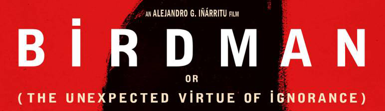
It's specifically the oddity of the tittles on uppercase that i'm interested in. A typeface like PDU by Colophon has great letterforms but is there anything like this with the tittles?
It's specifically the oddity of the tittles on uppercase that i'm interested in. A typeface like PDU by Colophon has great letterforms but is there anything like this with the tittles?

You could look for typefaces which support Turkish, specifically Latin Capital Letter I with Dot Above Unicode: U+0130 (İ), used to differentiate capital I from capital dotless I.
It’s that |R| that is so unusual, with the bowed leg. Trivia Sans comes close (though it’s dotted capital |I| has a dot that isn’t as wide as the letter itself), but it’s not a match for other letters, such as the |G|:
http://www.myfonts.com/fonts/storm/trivia-sans/
I've seen a few DIN-ish typefaces with a similar |R| (but I don't have time now to hunt them down to check for Turkish support).
Captured from web.archive.org on 21 Feb 2015. view this capture