
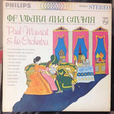

It’s a moot point whether this is faux Cyrillic or faux Latin.
Does anybody know which Cyrillic font (if any) these glyphs are taken from?

The album is from 1965; the versions in other languages - Russie de Toujours (France - 1965), Vodka and Wine (UK - 1966), Rußland wie es klingt und swingt (Germany - 1967), Russian Souvenirs (Holland - 1969) were more dignified; only in the United States was faux Cyrillic resorted to.

US version of the sleeve may reflect the inclination of Americans to mock Russia in 1965, which was smack dab in the middle of the Cold War.
Nick, is there an illustration credit on that sleeve anywhere? That art looks like the work of Seymour Chwast.

I was thinking Heinz Edelmann (Yellow Submarine)
Here is an American version without Faux Cyrillic.


Seymour Chwast http://aceandson.com/blog/?p=827 or Heinz Edelmann?
I can't decide. Their styles are so similar.
Don
As for the Faux Russian letters, there is some pretty similar stuff in the Cyrillic glyphs of Parachute's Bodoni http://www.myfonts.com/fonts/paratype/bodoni/bodoni/glyphs.html and New Standard http://www.myfonts.com/fonts/paratype/new-standard/pt-new-standard/glyph... The latter was widely used in Russian language publications churned out by Moscow during the 1950s and 196o's and would almost certainly have been seen by a lettering artist of the era researching how to do a Faux Cyrillic.
Don
I thought the fine printing on the lower left of the label might name the artist, but a closer look tells me it begins "Mercury Records Corp. 35 E. Wacker Drive, Chicago Ill." with some assistance from Google, and ends "Printed in U.S.A.", perhaps just after a dash.
It’s very sophisticated.
Every character appears to be drawn from scratch, none taken from an exisiting font.
I wonder what the rest of the alphabet would look like?!
I'd say that it's considerably more likely to be Heinz Edelmann than Seymour Chwast; but I think that this particular style of illustration was used by many artists in that period, so I would not be confident of it being Heinz Edelmann.

The several phi and A letters are identical (I 'fused' pairs visually as in stereoscopic imaging, and the slightest difference would have immediately shown). A possibility is that they were concocted using parts of letters and decorative elements from a Letraset transfer sheet which had their heyday in the sixties.
Captured from web.archive.org on 14 Apr 2015. view this capture
Cute, but for some people who read Cyrillic a Faux Russian with Cyrillic letters substituted directly for the wrong Roman letters is a painful mish-mash.
But I do like the artwork. A charming children's storybook style that evokes the beloved family characters of Tolstoy's War and Peace.
Don