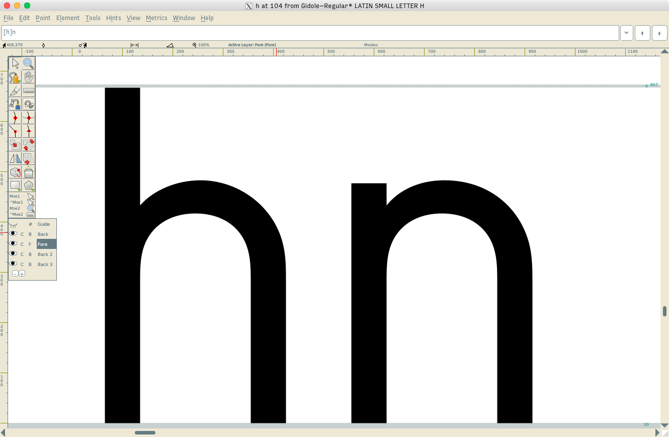
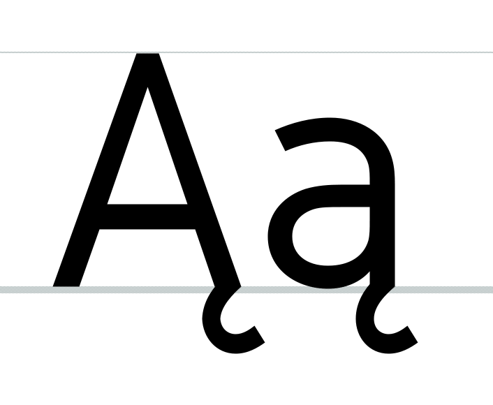
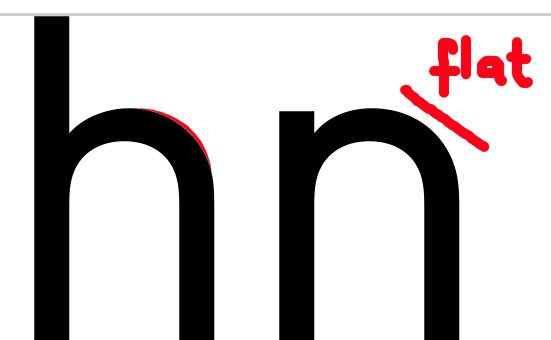
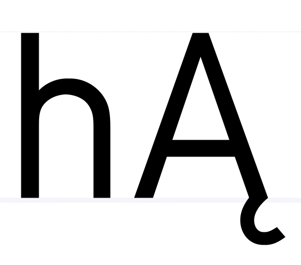
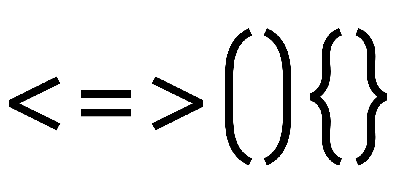
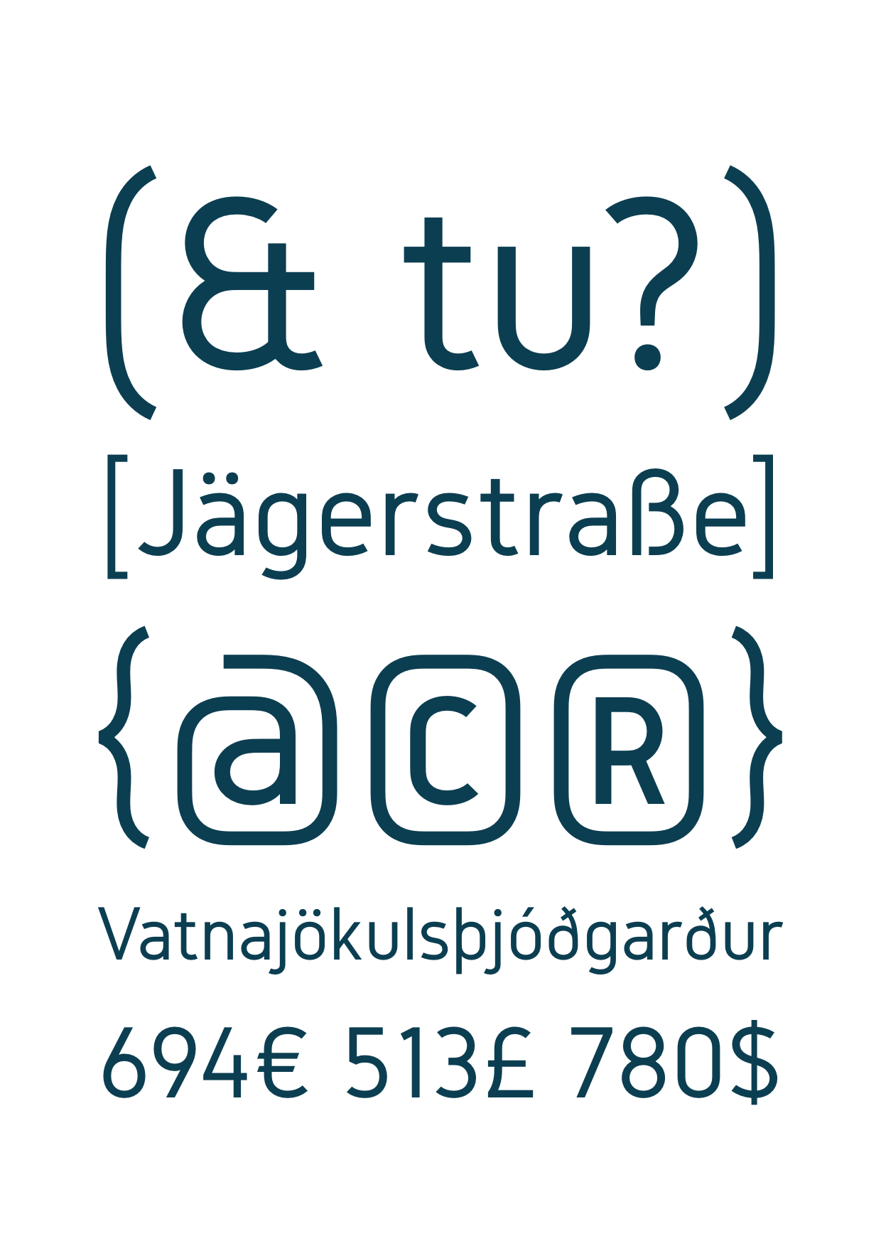
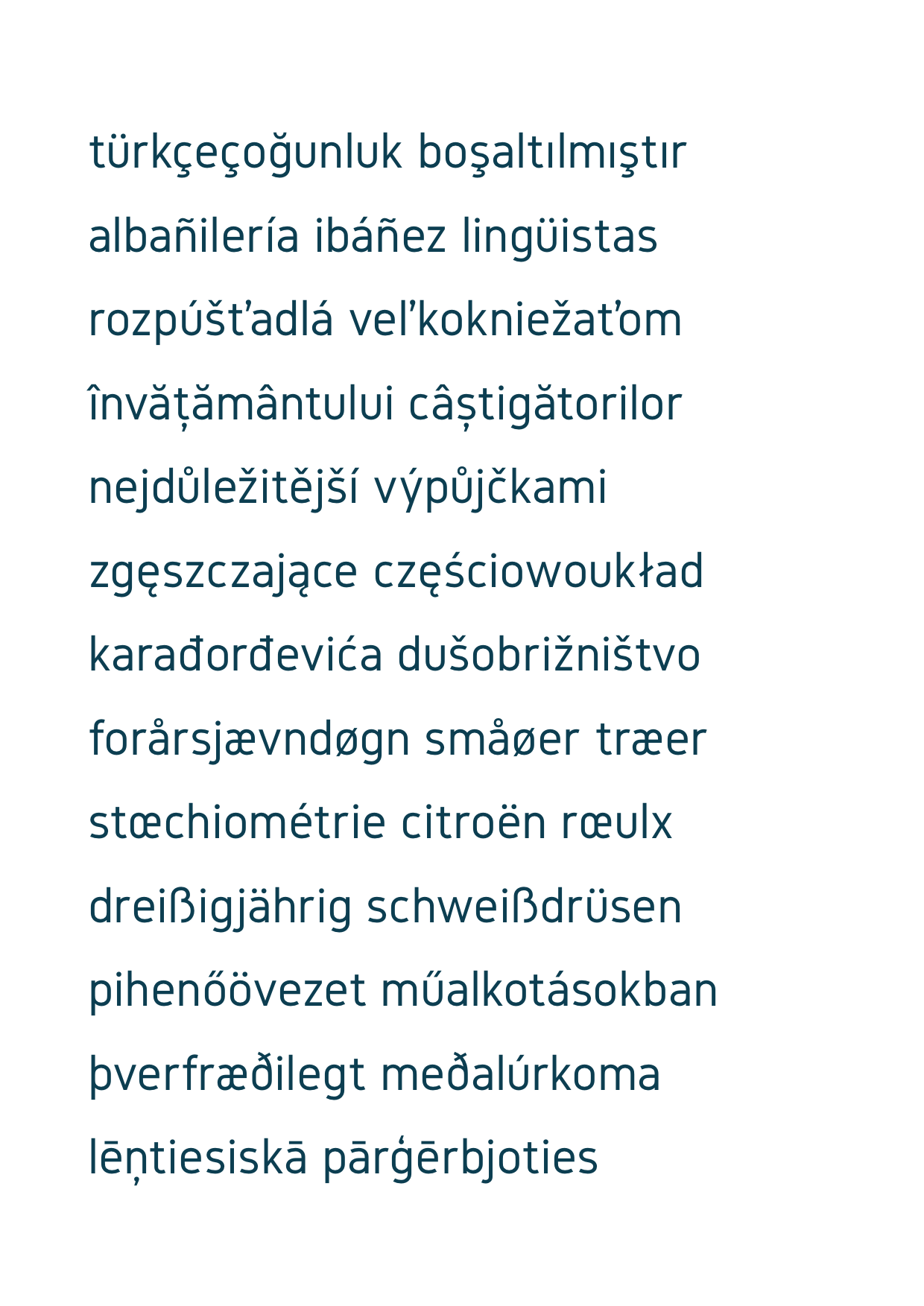
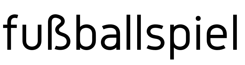
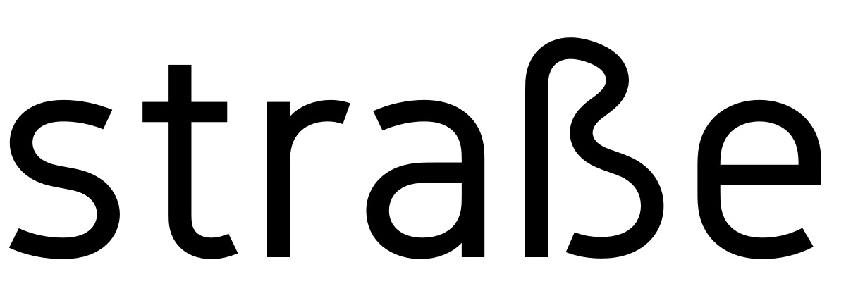
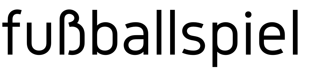
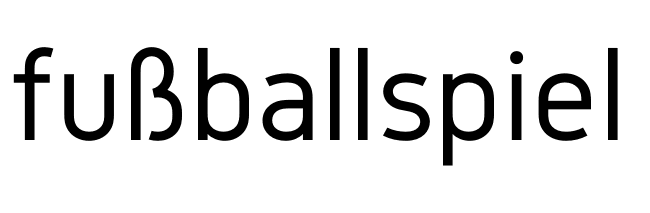
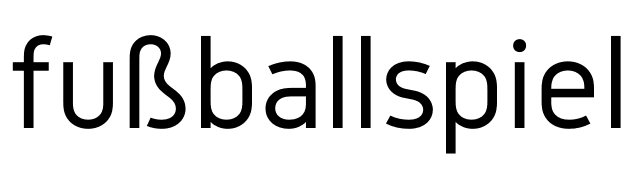
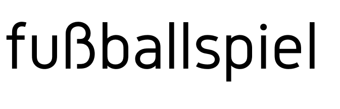
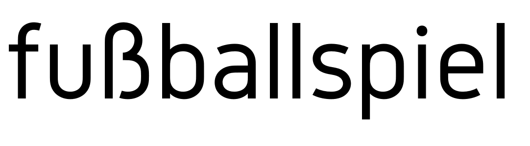
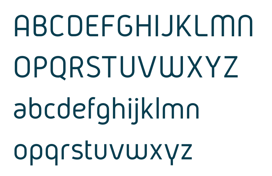
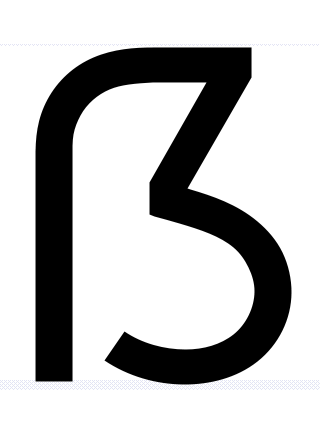
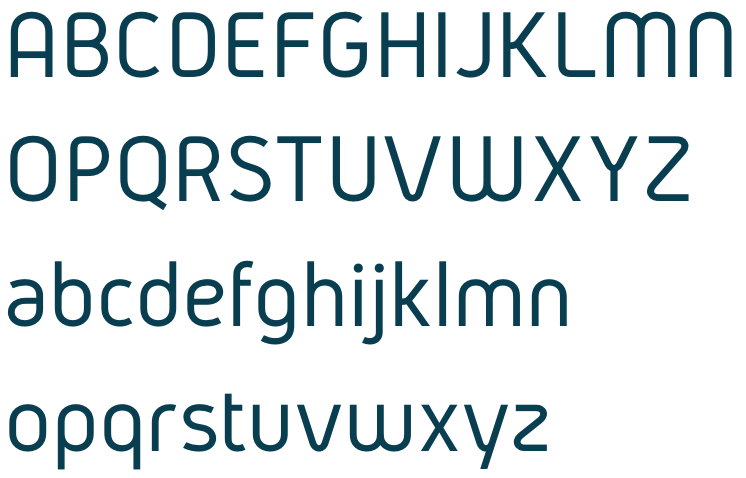
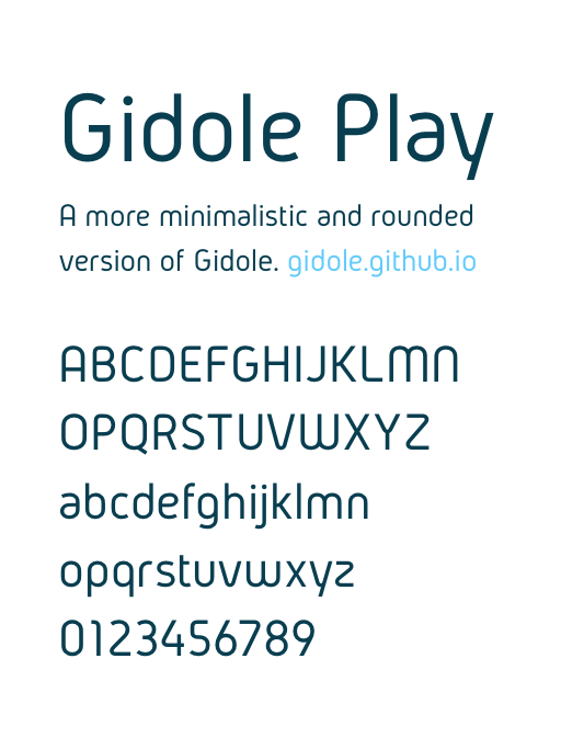
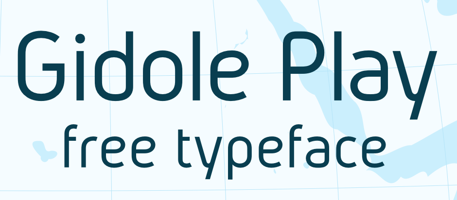
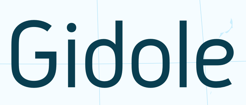
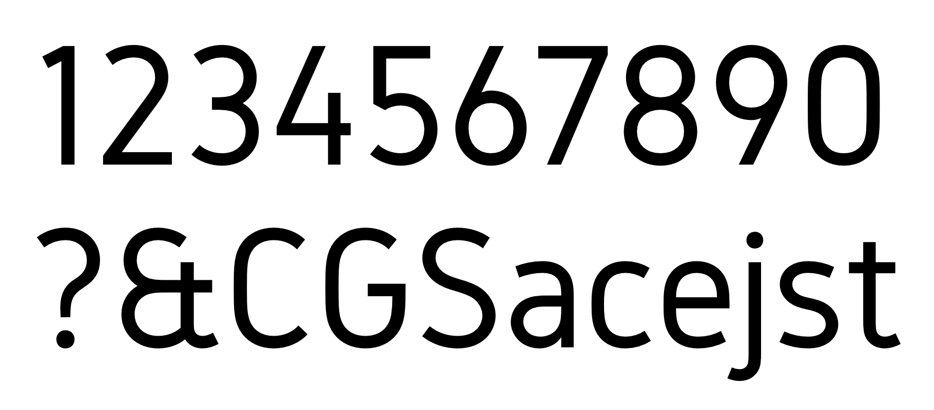
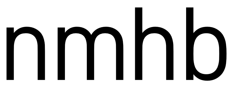
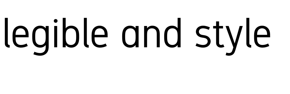
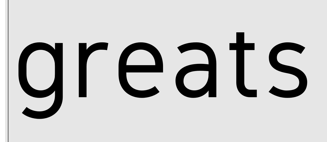
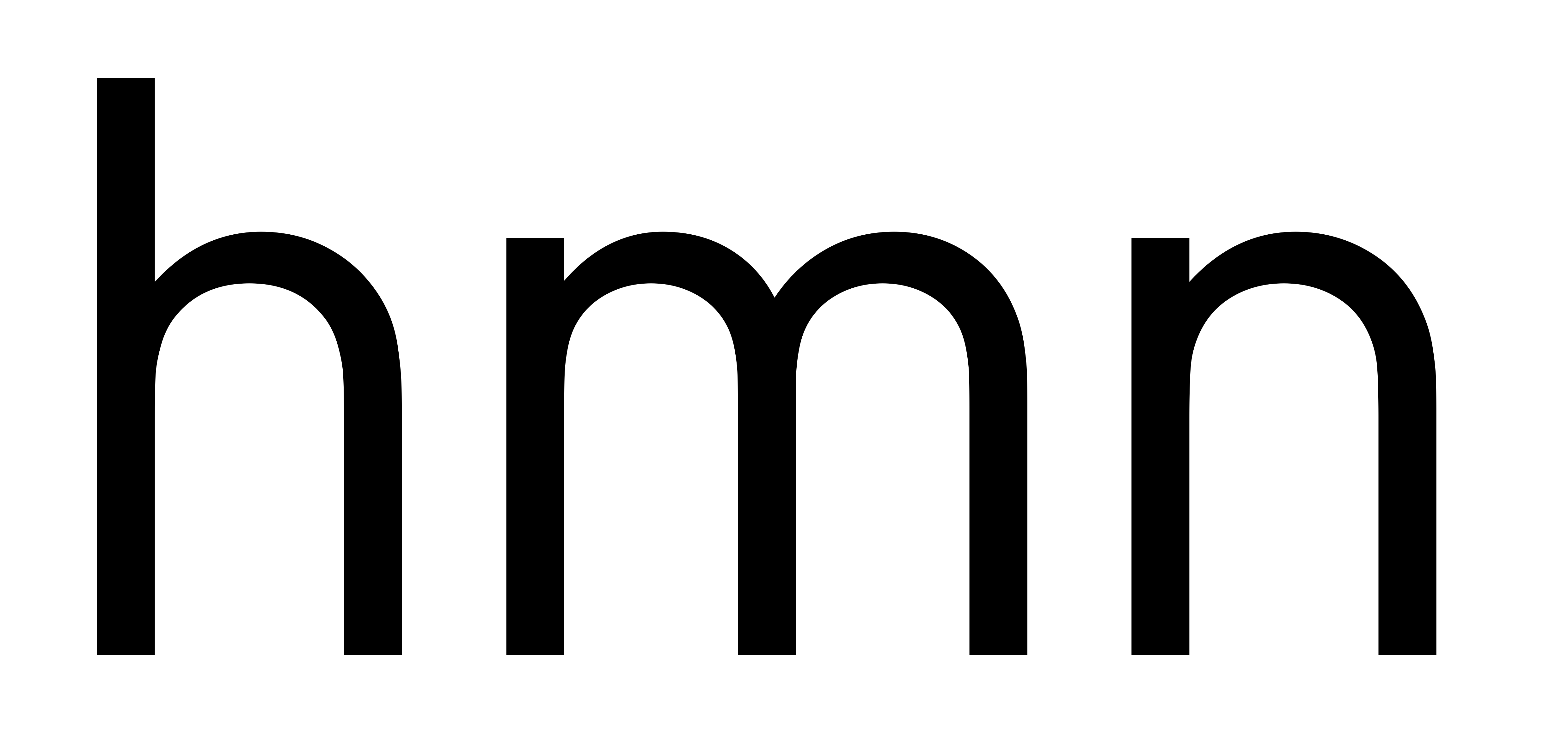
I'm creating this and would love some feedback. The typeface will be free and with multiple weights when done.
I haven't done any kerning and the spacing is very rough. Focus right now is on getting the glyphs as I want them and trying to do some optical corrections.
See the pdf's for more detail and sample text.

 Headlines.pdf
Lettering.pdf