
I was hoping someone would know the typeface used for this heading.

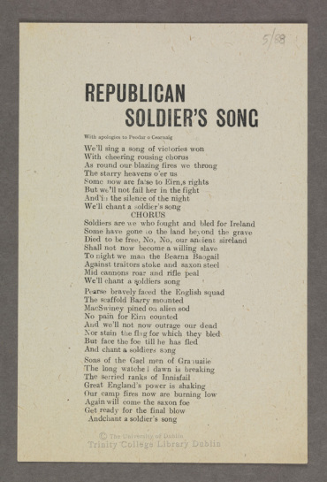
Font:
KLIM’s Founders Grotesk Extra Condensed Medium
Solved By:
I was hoping someone would know the typeface used for this heading.
That |G| is highly unusual for a gothic. Does your sample date from the 1920s?
I’m not sure what the original metal typeface was, but here are a few digital typefaces (with a bit of surgery on the crossbar of the |G|) that could help you replicate the look:
http://www.myfonts.com/fonts/linotype/alternate-gothic-lt/
http://www.myfonts.com/fonts/flat-it/rama-gothic/
http://www.felicianotypefoundry.com/cms/fonts/grotzec-condensed
https://klim.co.nz/retail-fonts/founders-grotesk-condensed/
It is probably from around that time and could easily be a mismatch of different typefaces. But thanks a lot, those suggestions are great!

Founders Grotesk is definitely the best option here. I'd like to add a ready-to-go option with Penny Lane which has a crossbarless /G but you'd have to artificially compress it (ouch).
Thanks I really appreciate all the help. The Founders Grotesk is pretty spot on!
Thanks for introducing me to Penny Lane, Ryuk. Some of my ancestors lived in Liverpool in the mid 1800s, and I’ve always liked the street signs in the photos my family has of the era.
Glad you found a typeface you like Sarah, but I did suggest it first (see my original post above)....
Captured from web.archive.org on 17 Mar 2015. view this capture
After considering various options I would suggest as the closest substitute, KLIM's Founders Grotesk Extra Condensed Medium, which is based on a 1912 Miller & Richard specimen of No.7 Grotesque all-caps.
For a closer match clip the bar on _G_
Also compare to the Semibold weight
Don