Typophile

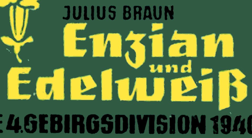
Blackletter 1955 book Enzian und Edelweiss By Verlag Hans Henning Podzun

Donald H. Tucker

This blackletter is on the cover of a book _Enzian und Edelweiss_ [two alpine plants] published by Verlag Hans Henning Podzun in 1955.
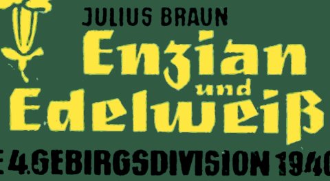
Larger scale image attached.
I don't know of a digital font that matches, but perhaps there is something from metal type or the photo-type/contact-letter sheet era?
Failing that, does anyone know of any more letters in this style? Perhaps the letters are modeled on something from a lettering book? Any more book covers by this publisher or others?
Thanks.

Don

AttachmentSize
VerlagHansHenningPodzun1955EnzianUndEdelweiss.jpg73.87 KB

The title is most certainly lettered (look at the two |E|s), I can't say if based on a formalized style.

Incidentally, a blackletter called Enzian exists (http://www.myfonts.com/fonts/polygraph/enzian/), but it definitely has a different style.

Thanks Riccardo for the link to a nice modern blackletter.
I realize that the book tile is hand lettered, but I was hoping that it might have been inspired by a font of some sort.
Failing that I would love to see any more lettering in this style.
Perhaps one of our super lurkers might have some ideas.
Don

Two modern reinventions of the blackletter that, in my opinion, share some aspects with this nice kind of square wide fat lettering:
http://www.type-together.com/Eskapade
http://www.myfonts.com/fonts/storm/moyenage/

There are others but, for what I can see, they tend to resolve contrast eliminating thin strokes and replacing them with the pointed terminals of wide strokes. Also, most of them go for an hexagonal grid, which prevents horizontal strokes of some substance.

Thanks Riccardo, for mentioning Eskapade & Moyen Age. I had looked at them some time ago and liked what I saw as good reinterpretations of blackletter.

I agree the hexagonal grid in many blackletter updates is not good. In my opinion it is too mechanical and too far from what makes blackletter appealing -- the variation in strokes and emphasis which can sometimes give an effect that is both organic and dramatic, as is well expressed in this lettering.
Anyone else with some leads or thoughts?
Don

This made me think of Rustikalis Black, even though it's quite different. similar in its quirkiness only. From the 1970's for the photolettering company, VGC (Mr. Wooden fails to give attribution for his revivals).

Good find Mike! The stroke widths and pen treatment definitely place Rustikalis Black in the same category as the mystery lettering:


Also, thanks for providing the provenance.
Don

Captured from web.archive.org on 17 Mar 2015. view this capture